Designing for Focus:
A Calm Task App for ADHD Minds

15+ screens
designed
Passion
project
Accessibility
focused
AI-powered

01. The Problem I Wanted to Solve

I've watched friends with ADHD struggle with task apps. The problem isn't them. It's the apps.
Most productivity apps assume you can just break down projects, prioritize tasks, and stay motivated through lists. But ADHD brains don't work like that. Even opening the app can trigger paralysis.
I wanted to design something that actually helps ADHD users get things done; not just organize what they can't do.

Why Existing Apps Fail

I looked at popular task apps (Todoist, Things 3, Any.do, TickTick). They all make the same mistakes:
  • Forms create friction
  • Big tasks cause instant shutdown
  • No help when you're stuck

1. Forms Create Friction

Want to add a task in most apps? You have to fill out: task name, due date, priority, project, tags, description.
For someone already struggling to start, this is a barrier before you even begin. By the time you've decided which project it belongs to and what priority to assign, you've lost momentum.
The organization system meant to help becomes the obstacle.

2. Big Tasks = Instant Shutdown

Add "Finish thesis intro" to a normal task app. It just sits there in your list, looking manageable.
But for ADHD users, this task is overwhelming. The brain can't chunk it into steps. So it sits there. Gets more intimidating. Creates guilt.
What ADHD users actually need:
"Finish thesis intro" broken into:
  • Open your document
  • Write the first sentence
  • Add one supporting point
Most apps don't help with this at all.

3. No Support When Stuck

When you hit that ADHD wall (you know what to do but can't make yourself start), task apps offer nothing.
They're just static lists. Accumulating overdue badges. Breaking streaks. Making you feel worse.
No coaching. No encouragement. No alternative suggestions. Just tasks you're "failing" to complete.
"I have 20 tasks but no idea which to start"
"Big tasks paralyze me. I need tiny steps"
"I need someone to just tell me: do this one thing"
"Everything feels equally impossible"
— From ADHD communities on Reddit

What ADHD Actually Is

ADHD isn't about attention. It's about executive function. Your brain's ability to plan, organize, start, and follow through.
ADHD brains struggle with:
  • Decision paralysis: Too many choices = shutdown
  • Task initiation: Starting is harder than doing
  • Working memory: Forgetting tasks 30 seconds after thinking of them
  • Time blindness: No sense of how long things take
  • Motivation: Hard to start tasks without immediate reward
Most productivity tools treat these as personal failings. Like you just need to be more organized.
But what if the tool adapted to these challenges instead?

The Opportunity

What if a task app could:
  • Accept messy, chaotic input
  • Recognize when you're stuck or overwhelmed
  • Break down big tasks for you
  • Tell you what to work on when choosing feels impossible
  • Celebrate small wins without being annoying
  • Never shame you with red badges or broken streaks
But what if the tool adapted to these challenges instead?

02. My Approach & Key Features

I needed to solve a design problem: how do you build an interface for users who struggle with interfaces?
The solution I landed on was counterintuitive. Less UI, not more.

Design Decision 1: Single Input for Everything

The Problem: Separate "add task" and "get help" buttons create decision points. For ADHD users, even small decisions cause friction.
What I considered:
  • Option A: Traditional approach (separate buttons for different actions)
  • Option B: Chat-only interface (conversational throughout)
  • Option C: Single input that routes intelligently
Why I Chose Option C: The input bar handles both tasks and questions. Type "Call dentist" and it adds a task. Type "I'm stuck" and it starts a conversation.
This removes the decision of "which mode am I in?" The system figures it out.
Trade-off: Had to build logic to parse user intent. But that complexity lives in the system, not the user's head.

Design Decision 2: Proactive AI vs Reactive

The Problem: Traditional apps are reactive. You add tasks, they store them. That doesn't help when the task itself is the barrier.
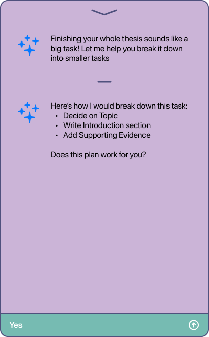
What I Built: The AI detects when a task feels too big ("Finish thesis") and proactively offers to break it down.
Why: ADHD users know they should break tasks into steps. But doing that breakdown IS the hard part. The app does it for them.
Implementation: When a task has vague verbs ("finish," "start," "complete") + large scope words ("thesis," "project," "house"), the AI triggers.

Design Decision 3: Decision Support Flow

The Problem: "I don't know what to work on" is a common ADHD struggle. Staring at a list doesn't help.
What I Built: Two-step decision tree:
  • 1. Time available?
  • 2. Energy level?
Based on answers, the app suggests a specific task.
Why These Two Variables: Time and energy are the main constraints. Priority doesn't matter if you don't have energy for it. Importance doesn't matter if you only have 5 minutes.
Alternative I Rejected: Letting users manually set task priority. That's just another decision to make, another source of friction.

Design Decision 4: Tone & Feedback

The Challenge: How do you give feedback without triggering shame?
Approach:
  • No "overdue" language
  • No red colors for missed tasks
  • Focus on what WAS done, not what wasn't
Example: "You finished 2 of 3 tasks today" instead of "1 task incomplete"
Why: ADHD users already internalize failure. The app shouldn't reinforce that pattern.

Core Principle

Every design decision came back to one question:
"Does this reduce cognitive load or add to it?"
If it added friction, I cut it. Even if it's a standard feature in other task apps.

03. Early Explorations (Wireframes)

Before jumping into Figma, I thought through different ways this could work. I didn't build out every option, but I needed to think through the trade-offs.

Option 1: Pure Chat Interface

Everything as a conversation. Like texting with an assistant.
Why I didn't pursue it:
  • Chat history would get cluttered fast
  • Can't scan your full day at a glance
  • Typing "done" is slower than tapping a checkbox
  • Too much back and forth for simple task management
The insight: Conversations work for complex help, not basic task entry.

Option 2: Separate Task and AI Modes

Traditional task list with a dedicated "Ask AI" button. Two distinct areas.
Why I didn't pursue it:
  • Forces users to decide which mode they're in
  • Separates the AI from the core experience
  • Adds a decision point before you can act
The insight: Mode switching creates friction, even if it's just one tap.

What I Built: Hybrid Approach

I went with a single input bar that handles both tasks and questions.
Type "Buy milk" and it adds a task.
Type "I'm stuck" and it opens a conversation.
The system figures out what you need. No modes. No separate buttons.
Why this made sense:
  • Removes the decision of "which mode am I in?"
  • Keeps the visual list for scanning
  • AI is present but not intrusive
  • Fast for simple actions, supportive for complex ones

Lo-Fi Wireframes

I started with basic wireframes to work out the structure and flow.
Key decisions I made at this stage:
  • Input at the bottom. Mobile-friendly. Your thumb is already there. Easy to reach without stretching.
  • Minimal task cards. Just task name and checkbox. No visual clutter. Clean and scannable.
  • AI as temporary overlay. Conversations appear as modals, then disappear. Keeps the main list focused on tasks, not chat history.
  • No nested navigation. Everything lives on one screen. No tabs, no menus. Less to remember, less to navigate.
These wireframes weren't polished. They were quick sketches to test if the structure would work before investing time in visual design.

04. Design Decisions & Rationale

Once the structure was solid, I focused on visual design. The goal was to create something calm and approachable, not another sterile productivity tool.

Color Palette

The Challenge
Most task apps use corporate grays or high-contrast primaries. Neither works for ADHD users.
Gray feels lifeless. Bright colors overstimulate.
I needed something in between: calm but not boring, colorful but not overwhelming.
The Palette:
Primary:
  • Mist Lavender #E9D9EB (background)
  • Heather Violet #CBB4D7 (cards, surfaces)
  • Royal Purple #7D60A4 (buttons, accents)
Accent:
  • Teal #3C9E91 (input bar, section headers)
Text:
  • Charcoal Plum #2A1E3E (primary text)
  • Slate Violet Gray #4F517D (secondary text)
Accent:
  • Soft Green #8CD790 (success states)
Why These Colors:
Purple: Associated with calm and creativity. Not the aggressive red/orange often used for productivity. Feels supportive, not demanding.
Teal: Provides energy and focus without being harsh. Works as an accent without competing with the purple base.
Soft, desaturated tones: ADHD users can be sensitive to overstimulation. Muted colors reduce visual fatigue while maintaining enough contrast for clarity.
WCAG Compliance: Every color pairing was tested. All text meets AA standards (4.5:1 minimum contrast ratio).

Typography

Font: SF Pro (iOS system font)
Why:
  • Native to iOS, loads instantly
  • Designed for screen readability
  • High legibility at all sizes
  • Users already familiar with it
  • Professional without being corporate
What I Avoided:
  • Multiple font families (creates visual noise)
  • Excessive bolding (loses emphasis)
  • Text below 14px (accessibility issue)

Intentional Simplicity

The Design Principle:
The interface is simple on purpose. Not because I ran out of time or ideas. Because simplicity IS the feature for ADHD users.
What I Removed:
  • Tags and categories: More organization options = more decisions = more friction
  • Priority flags: Choosing importance creates paralysis. The app suggests what to do instead.
  • Due date pickers: Complex date selection adds steps. Natural language parsing handles it ("tomorrow," "Friday").
  • Navigation tabs: Everything lives on one screen. No context switching.
  • Decorative elements: No illustrations, no gradients, no shadows (except subtle elevation). Just content.
Why:
Every removed element is one less thing to process. For ADHD brains that struggle with filtering information, a clean interface reduces cognitive load. This isn't minimal because it looks modern. It's minimal because it works better.

Accessibility

WCAG Compliance:
All color combinations were tested using contrast checkers. Text maintains at least 4.5:1 ratio against backgrounds.
Other Considerations:
Touch targets: Minimum 44x44px for all interactive elements. Input bar and checkboxes are larger for easier tapping.
Visual hierarchy: Size and weight create structure, not just color. Works for colorblind users.
Motion: Animations stay under 400ms. Nothing flashes or loops. Reduces overstimulation risk.
Language: Simple, direct microcopy. Avoids jargon. Supportive tone throughout.
Accessibility isn't a checklist. It's baked into every decision.

05. Visual Design System

I built Luma using components and auto layout from the start. Even for a passion project, working with a system makes iteration faster and keeps everything consistent.

Component Library

Why I Built Components:
Instead of designing each screen from scratch, I created reusable components. Change the input bar style once, and it updates across all 15+ screens instantly.
This isn't just efficient. It ensures consistency. Every button, every card, every interaction follows the same logic.
Core Components:
  • Input bar
  • Task card
  • AI modal
  • Buttons

Input Bar Component

The input bar is the most complex component. It handles multiple states and modes.
States I Built:
  • Default: Placeholder text, teal background, icons visible
  • Focused: Slightly darker background, cursor visible, ready for typing
  • Success: Green border flash after adding task
  • AI Mode: Same visual, different context (conversation vs task)
Auto Layout Structure:
The entire bar uses auto layout with horizontal padding. Icons on the left and right stay fixed while text expands. This means the bar adapts to different text lengths without breaking.
The component has variants for each state. I can swap between them in prototypes without rebuilding screens.

Task Card Component

Each task is a component with its own states.
Variants:
  • Unchecked: Default state, checkbox empty
  • Checked: Checkbox filled, text slightly faded
  • Subtask: Indented, smaller checkbox, nested under parent task
Auto Layout Structure:
Horizontal auto layout with the checkbox on the left and text on the right. Padding adjusts automatically. If task text wraps to multiple lines, the card height grows without manual resizing.
This made building task lists fast. I could duplicate and change text without worrying about alignment.

AI Modal Component

The AI conversation appears as a modal overlay. It's also componentized.
Everything uses auto layout. Add a new line of text, and the modal grows. Remove a button, and spacing adjusts automatically.
This meant I could prototype different conversation flows without redesigning the modal each time.

06. Final Designs & Reflection

After three weeks, I had a functional prototype that solves the core problem: helping ADHD users actually get things done.

Key Flows

The final design covers four main flows:
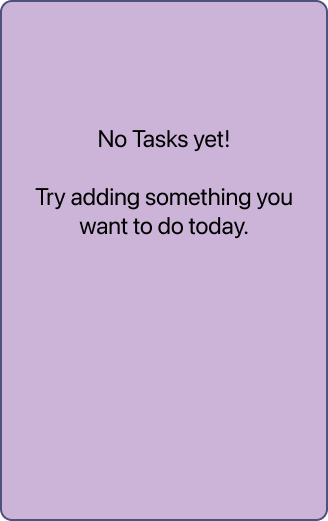
  • Task Entry Empty state → Add task → Task appears in list
  • AI Task Breakdown Add big task → AI offers help → Subtasks generated → Confirm
  • Decision Support "I don't know what to work on" → Time + Energy questions → Task recommendation
  • Completion Check off task → "Nice work!" → Progress update → All done state

What Worked

Single input bar: Removing the decision between "add task" and "ask for help" actually worked. The hybrid approach feels natural.
Proactive AI: Having the system detect big tasks and offer to break them down addresses a real ADHD pain point. It's not just reactive task storage.
Calm visual design: The soft purple palette and minimal interface create the right emotional tone. It feels supportive, not demanding.
Accessibility focus: Testing everything against WCAG standards from the start meant accessibility was built in, not added later.

What I'd Improve

User testing: This is a concept project. I didn't test with actual ADHD users. Real feedback would reveal friction points I didn't anticipate.
Subtask hierarchy: The visual distinction between main tasks and subtasks could be clearer. Right now they're just listed sequentially.
Completion animations: The confetti works, but I'd experiment with more subtle celebration options. Some users might find it too much.
Voice input: I designed for typing, but many ADHD users prefer speaking. Adding voice would reduce another barrier.

What I Learned

Simplicity requires more thought, not less. Every feature I didn't include was a decision. Removing things is harder than adding them.
Design for mental states. The decision support flow exists because I thought about the user's emotional state, not just their to-do list.
Accessibility benefits everyone. Design choices for ADHD users (clear hierarchy, reduced clutter, supportive tone) make the app better for everyone.
Building a component system from the start saves time. Using Figma components with auto layout meant I could test different layouts and content without rebuilding screens. Change one component, update everywhere. Structure enables faster iteration.

Next Steps

If I continued this project:
  • User research Test with ADHD users. Watch where they struggle. Adjust based on real behavior.
  • AI Task Breakdown Add big task → AI offers help → Subtasks generated → Confirm
  • Expanded AI capabilities: Time-based suggestions ("You usually have energy in the morning"), pattern recognition ("You always avoid this task"), and gentle accountability ("You said you'd do this yesterday").
  • Focus mode Single-task view with timer. Minimal distractions. Built-in break reminders.
  • Cross-platform Start with mobile, but ADHD users need support everywhere. Desktop and web versions would help.
  • Integration Connect with calendar, email, other tools. Reduce app-switching friction.