Before touching visual design, we established design principles that would guide every decision, from information architecture to interaction patterns. These principles became our framework for evaluating ideas, prioritizing feedback, and making strategic trade-offs.
Design Principles: Our Decision-Making Framework
1. Progressive Complexity:
Start simple, reveal complexity only when needed. John should complete basic tasks without encountering advanced features, while Dylan can access powerful functionality when necessary.
2. Maintain Mental Models:
Changes should feel like improvements to familiar patterns, not radical departures. This reduces the training burden Dylan faces when onboarding others.
3. Make Relationships Visible:
Connections between data, modules, and workflows were hidden. Make hierarchies, dependencies, and relationships explicit in the interface.
4. Support Multiple Workflows:
The interface should support both linear, guided workflows (for John) and non-linear, expert shortcuts (for Dylan).
Lo-Fi Phase: Strategic Structural Decisions

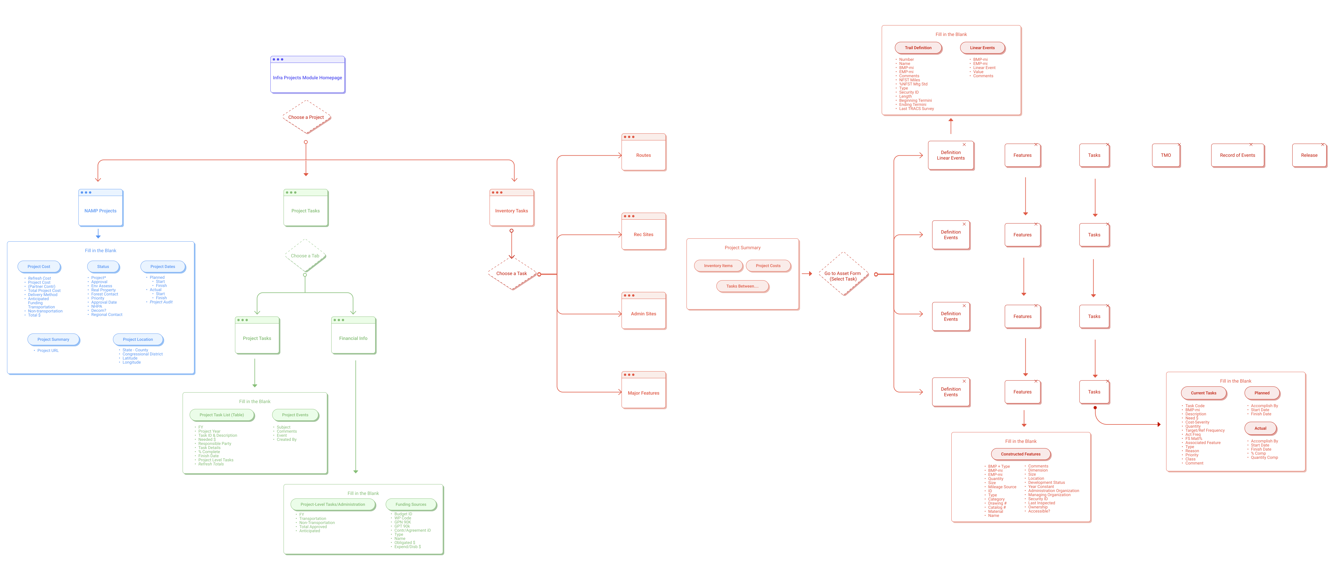
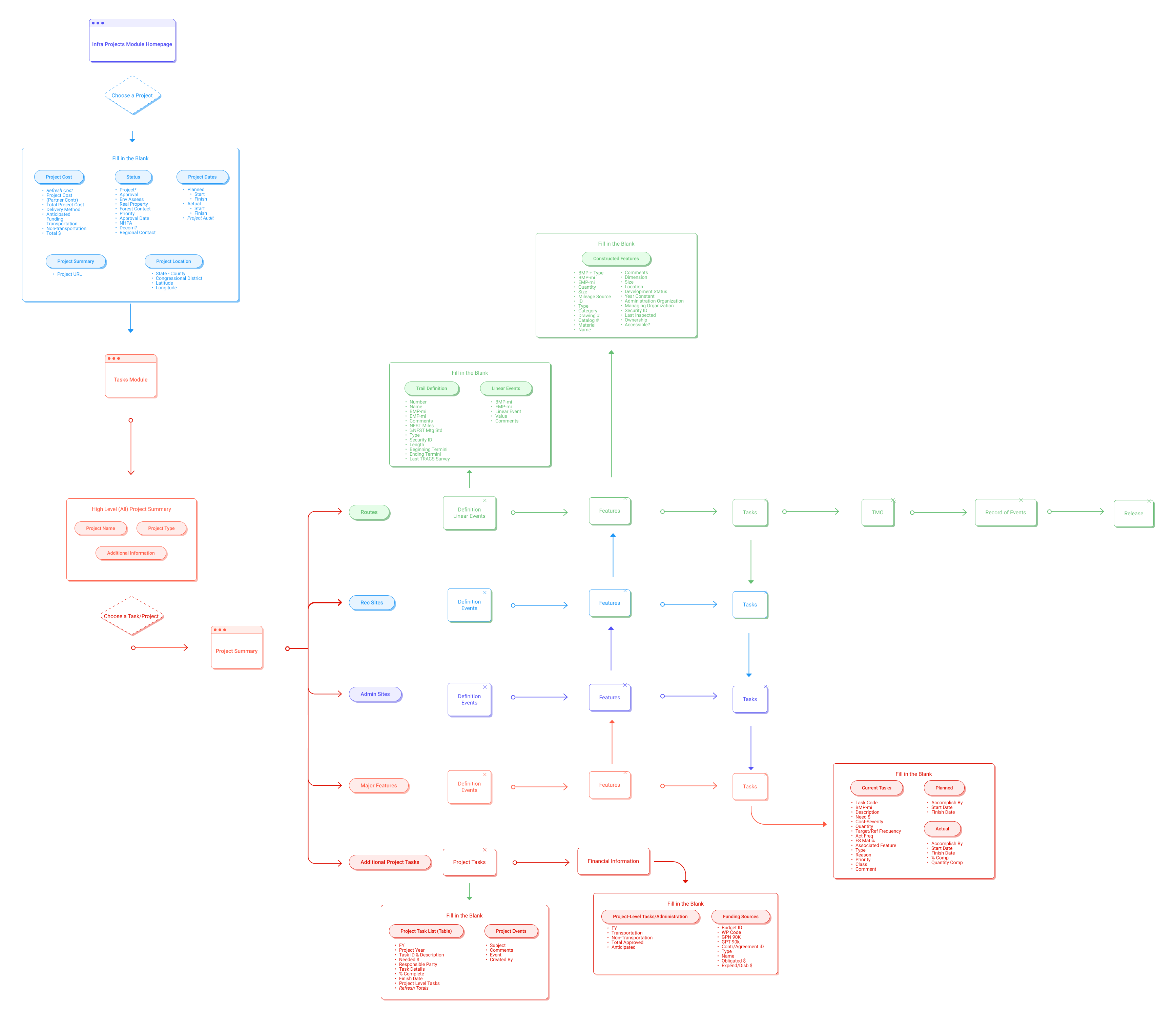
Decision 1: Left Navigation for Task Hierarchy
Persistent left sidebar shows all task types (Routes, Rec Sites, Admin Sites, Major Features) in an expandable tree. Users see the full project structure and jump directly to any task.
Trade-off: Screen real estate vs. constant context. We chose constant context because research showed users got lost navigating between task types.
Decision 2: Consistent Tab Structure Across All Modules
Every task type (Routes, Rec Sites, etc.) uses the same four tabs: Def/Linear Events, Features, Tasks, and Maps. This creates a predictable pattern users learn once and apply everywhere.
Trade-off: Perfect customization vs. consistency. We chose consistency because Dylan struggled teaching users when each module had different structures.
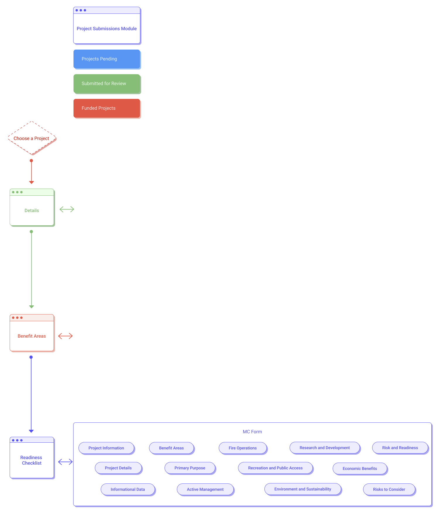
Decision 3: Accordion Sections with Progress Indicators
In Project Submissions, we used collapsible accordion sections (Project Information, Project Details, Benefit Areas, etc.) with visible progress bars showing completion percentage and fraction (e.g., 50%, 3/6).
Trade-off: Screen real estate vs. constant context. We chose constant context because research showed users got lost navigating between task types.
Usability Testing: Validation
Left Sidebar Navigation
"I really like the sidebar and the ability to easily go between things within a project. Organization and layout and content makes sense."
Why this mattered: Validated "Make Relationships Visible." Users immediately understood project structure because it was spatially represented in the hierarchy.
Accordion Layouts with Progress
"Likes the progress bar for each collapsable. Some people will want to see the actual number completed."
Why this mattered: Validated "Progressive Complexity." Dylan could scan completion status (50%, 3/6) without expanding sections, while still diving deep when needed.
Hi-Fi: Strategic Visual Design

Visual Hierarchy Supports Task Navigation
The left sidebar uses visual hierarchy to show task relationships. Parent categories (Routes, Rec Sites) are bold with chevrons. Child items (D02013, R0203) are indented and lighter weight. This visual structure mirrors the data hierarchy.
Progress Indicators Show Completion at a Glance
Progress bars use dual indicators: percentage (50%) and fraction (3/6). Dylan can quickly scan multiple projects and see which need attention. The fraction satisfies users who wanted to know exactly how many items remained.
Breadcrumb Navigation Provides Spatial Context
Home > Projects Pending > [Project Name] > Task Summary > Routes > [Route Name] shows exactly where users are in the deep hierarchy. This prevents the "getting lost" problem from research.

These design decisions directly address the goals leadership brought us in to solve:
Data Accuracy:
Visible relationships (sidebar hierarchy) and clear progress indicators reduce errors from users not understanding what they're completing. Maps help users verify they're working on the correct physical locations.
Tracking Efficiency:
Left sidebar lets Dylan jump directly to any task type without clicking through menus. Progress bars let her scan multiple projects quickly. Consistent tab structure (Def/Linear Events, Features, Tasks, Maps) means she teaches one pattern that applies everywhere.
User Adoption:
Familiar patterns (file/folder sidebar, breadcrumbs, tabs) reduce the learning curve for John. Regional/Forest toggle shows only relevant questions. Progressive disclosure (accordions) prevents overwhelm while keeping power features accessible to Dylan.