Flow AI Landing Page:
Breaking the SaaS Template

Complete
landing page
Passion
project
Unique
navigation
UI design

01. Project Overview

Flow AI is a fictional productivity app that helps users work with their natural energy rhythms. I designed a complete landing page that breaks away from standard SaaS templates through unique structural elements and tactile design details.
Most productivity landing pages follow identical patterns: blue gradients, three-column benefits, aggressive "do more" messaging. I created a file folder navigation system that organizes content into cascading sections, paired with sticky note feature cards and an earth-tone palette that references analog office systems while maintaining digital polish.

02. Research & Wireframing

Competitive Analysis

I analyzed existing productivity landing pages (Motion, Notion, Asana, Todoist, Sunsama, Rise) to understand the landscape and identify opportunities for differentiation.
Key observations:
  • Most follow identical patterns: hero with mockup, three-column benefits, feature showcase, pricing
  • Heavy use of bright blues and purples with high-energy messaging
  • Emphasis on "doing more" and "productivity gains"
  • Little differentiation in navigation or content structure
There was clear opportunity to stand out through calmer aesthetics, analog metaphors, and unique structural elements that moved beyond standard templates.

Visual Direction

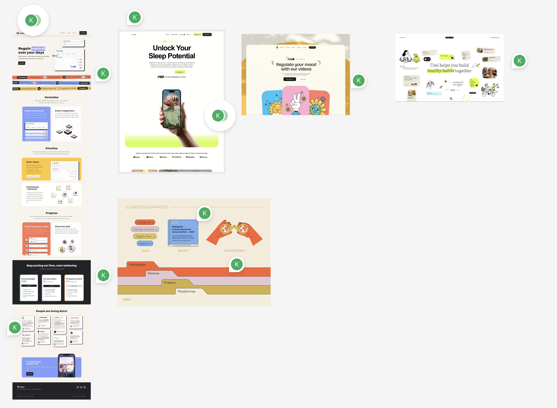
Before wireframing, I created a mood board to establish visual direction and explore potential design language.
The mood board explored:
  • Natural color palettes (forest greens, ocean blues, sandy creams)
  • Analog office organization (file folders, sticky notes, index cards)
  • Calm productivity aesthetics (soft tones, organic shapes)
This research pointed toward earth tones and tactile metaphors: a direction that would differentiate Flow AI from the bright, high-energy aesthetic dominating the productivity space.

Wireframing in Grayscale

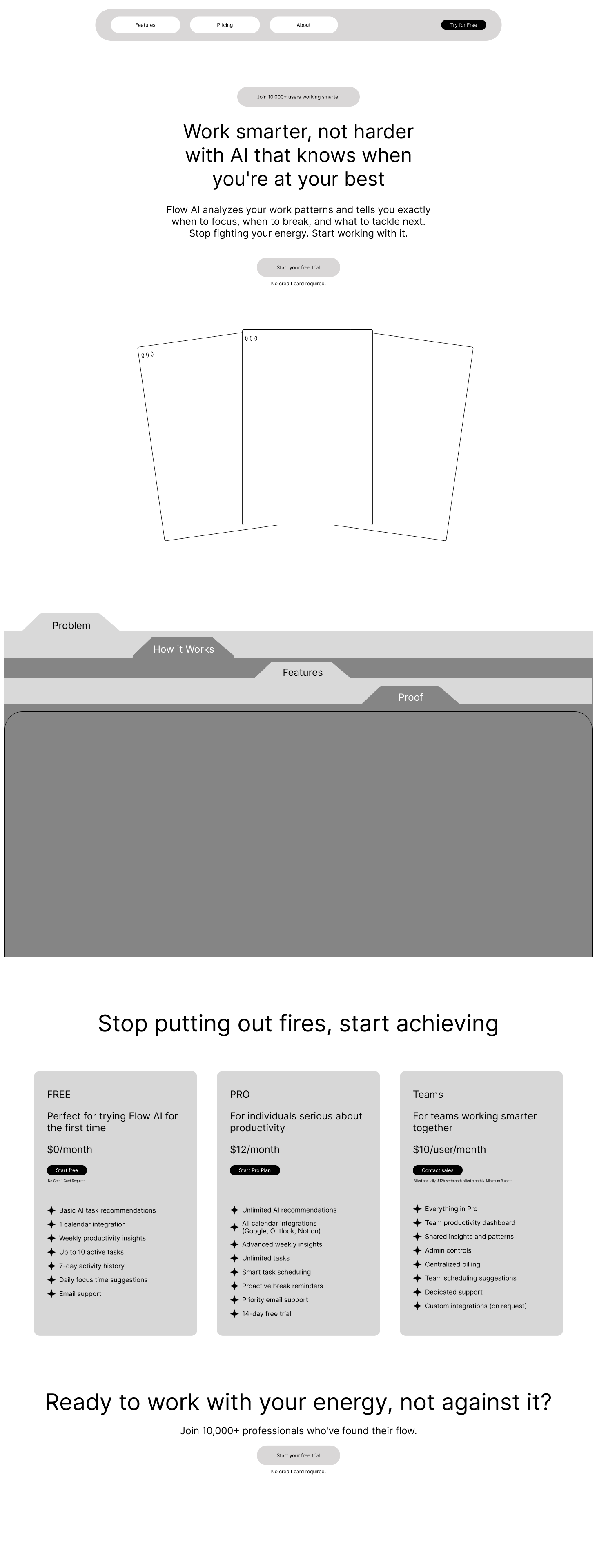
I started with low-fidelity wireframes in grayscale to focus purely on structure, hierarchy, and content flow before making any visual decisions.
During wireframing, I came across a reference image of cascading file folder tabs. This became the breakthrough concept for organizing content sections visually.
File folders solved two problems at once: they created clear visual sections while reinforcing the brand's focus on natural, systematic organization.
Instead of standard dividers or background color changes, each content section became a distinct "folder" with a labeled tab. The Struggle, How Flow Works, What You Get, Real Stories.

03. Visual Design System

With structure established, I developed a complete design system built around calm, natural aesthetics that would support the anti-burnout positioning.

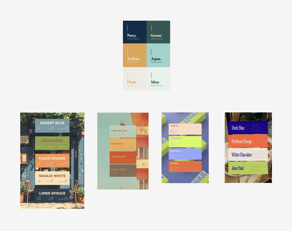
Color Palette

I chose earth tones over the bright blues and purples dominating productivity tools.
Navy (#0C2547): Primary color. Dark enough to feel grounded and professional. Not pure black, maintains warmth.
Green (#30523D): Secondary color. Forest green that feels natural and organic. Good contrast without being aggressive.
Aqua (#9FD3D0): Accent color. Calm and soothing. Works for highlights and hover states without feeling tech-heavy.
Yellow (#F0AC43): Energy color. Warm and inviting. Used sparingly for badges and attention-grabbing elements.
Cream (#FBE1B5): Background color. Warm and soft. Reduces eye strain compared to pure white while maintaining sophistication.

Typography

I paired IBM Plex Serif for headlines with IBM Plex Sans for body text.
Why this pairing works:
  • Both fonts from the same family (designed to work together)
  • Serif headlines add warmth and personality
  • Sans body ensures readability
  • Professional without being corporate
  • Clear content hierarchy

04. Signature Elements

Two design elements differentiate this landing page from every other productivity tool: file folder navigation and sticky note feature cards.

File Folder Navigation

The detail that makes folders read as folders, not just colored rectangles: the front flap.
Most productivity landing pages follow identical patterns: blue gradients, three-column benefits, aggressive "do more" messaging. I created a file folder navigation system that organizes content into cascading sections, paired with sticky note feature cards and an earth-tone palette that references analog office systems while maintaining digital polish.
Each open folder has a trapezoid-shaped flap at the bottom edge. The flap is 15-20% darker than the folder color and sits below the main content area.
Without this flap, folders are just colored sections. With it, the metaphor is instant and clear. This is an open file folder showing its contents.

Why File Folders Work

Visual organization. The tab system creates clear boundaries between content types without relying on standard horizontal dividers or background color shifts.
Brand reinforcement. File folders suggest systematic organization, filing things properly, working methodically. This aligns perfectly with the "work naturally" positioning.
Memorable differentiation. No other landing page uses this pattern. It stands out in a sea of identical templates while maintaining professional credibility.
The file folder system turns navigation into part of the brand story.
The details that make them work:
Adhesive strips. Each sticky note has a 10px horizontal strip at the top in a darker shade of the note color. This transforms a colored rectangle into a recognizable sticky note.
Pastel colors. Light yellow, pink, blue, and green outside the main palette. Soft enough to feel approachable, distinct enough to stand out.
Slight rotation. Each note rotates 1-3 degrees in different directions. Organic placement like real sticky notes on a wall.
Close shadows. Shadows sit close to the surface (Y: 3-4px, Blur: 6-8px) suggesting notes stuck to a board, not floating.
Strategic restraint: Sticky notes appear in two places only. Features section (full treatment with varied colors) and testimonials (subtle, same color). Using them everywhere would dilute their impact.

06. Final Designs & Reflection

What This Project Demonstrates

Complete design system creation from scratch. I established a full design language (color palette, typography, spacing, components) that supports the brand positioning through calm, natural aesthetics. Every color has purpose. Every spacing decision follows the system.
Creative problem-solving beyond templates. The file folder navigation system differentiates this landing page from identical competitors. It's memorable, on-brand, and functional. Not just decoration.
Design restraint and strategic choices. Sticky notes appear in two sections only. Not everywhere. File folders get front flaps for authenticity. Small details that matter. Knowing when to hold back is as important as knowing when to add.
Accessibility focus: Testing everything against WCAG standards from the start meant accessibility was built in, not added later.

What I'd Do Differently

User testing the folder navigation. The file folder system is visually distinctive, but I'd want to validate whether users find it intuitive or if it adds unnecessary cognitive load. The metaphor makes sense to me. That doesn't guarantee it works for everyone.
Mobile-first design approach. I designed for desktop and would adapt down to mobile. Starting mobile-first might have revealed simpler solutions that would improve even the desktop experience. Constraint drives better decisions.