KYC Onboarding for the Clients a Private Bank Can't Afford to Lose

3 users flows
10 screens designed
5 core features
Speculative PWM project
Disclaimer: Speculative project. Not affiliated with or commissioned by Goldman Sachs.
Problem:
Three parties work every KYC case simultaneously (client, advisor, compliance officer) with no shared view of what's happening. The process drags 15 to 45 days not because regulations require it, but because the coordination layer doesn't exist.
Who's affected:
HNW clients who were personally referred in. Advisors whose reputation depends on an outcome they can't see. Compliance officers making judgment calls on AI scores they can't interrogate.
What I designed:
Five features across three flows targeting the coordination failure, not the compliance engine itself.
What changed in the design:
I started with a summary card for the AI breakdown screen. Tested it mentally against how compliance officers actually document overrides and realized it was doing the same thing the existing system already does: handing Jessica a conclusion and asking her to trust it. Replaced it with a full check table. Small layout change. Different trust model.
What's unvalidated:
Screen 15's AI breakdown layer depends on a data contract I haven't confirmed. NICE Actimize and Oracle FCCM typically surface aggregate scores, not per-check breakdowns. That's the first technical conversation this project needs.

01. The Problem

Private banks promise is bespoke, white-glove service. This is a speculative redesign exploring what happens when a private wealth onboarding experience fails to live up to that promise.
KYC onboarding is not a compliance problem. It's an information problem.
KYC is the process every new private wealth client goes through before their account can be opened. Identity verification. Source of funds. AML checks. It is legally required, and it takes weeks. For private wealth clients at Goldman Sachs, virtually all of whom exceed the thresholds that trigger Enhanced Due Diligence under BSA/AML requirements, the process is more extensive than standard retail KYC, and that distinction matters for any timeline discussion.
The numbers show the scale of the problem. 89% of private bank clients reported a bad KYC experience in a Thomson Reuters survey. 13% switched providers because of it. 70% of firms lost clients due to onboarding friction in 2024, up from 48% the year before. A 40% first-pass document rejection rate, with each rejection adding 3 to 7 days to the timeline, turns what should be a days-long process into one that drags across weeks. These figures span private banking broadly and include rretail-adjacent wealth products, but the directional finding holds: onboarding friction is a documented relationship risk at the high end of the market, where a single lost client represents a materially different revenue consequence than in retail.
Three people are working every one of those cases at the same time. None of them have the same view of what's happening.

The Client

The client submits documents and waits. If something gets rejected, they get a generic error message. No reason. No next step. No timeline. For a private equity partner who was personally referred in, being treated like a form submission isn't just frustrating. It's a signal about what this relationship is going to look like.

The Advisor

The advisor brought the client in. Their reputation is tied to how this goes. When the client calls to ask what's happening, the advisor has to say "let me check on that." They have no more visibility than the client does. Instead of managing the relationship, they're stuck playing telephone between the client and compliance. Every hour they spend chasing case updates is an hour they're not spending on the work they're actually paid to do.

The Compliance Officer

The compliance officer is managing a high-volume queue of flagged cases. Each one surfaces a high-level designation: "High Risk." No breakdown. No confidence level. To make a responsible decision, she has to dig through the underlying documents manually. Every flagged case. Every time. The AI was supposed to make the job faster. Instead it handed the reviewer a conclusion and left them to do the reasoning themselves.

The Structural Problem

The compliance system was designed for compliance, not for the people around it.
Not for the people around it. Status changes happen inside the system, invisible to everyone. Document rejections go out without context. Every handoff is a potential failure point. Fix the coordination layer and you give all three people their time back.
One regulatory point matters here. Under the FinCEN Customer Due Diligence Rule, risk-based automation is explicitly permitted. No regulation requires a human to review every standard-risk case. Much of the 15-to-45-day timeline is operational, driven by tooling gaps and coordination failures, not regulatory mandate. (EDD cases, Enhanced Due Diligence cases, which most HNW clients require, carry additional review requirements that are legitimately policy-driven; this project's routing design accounts for that distinction.) The operational inefficiency is costing firms an average of $25,000 per lost client opportunity (Fenergo, 2024 Global KYC and Onboarding Report). Fix the coordination layer and you give all three people their time back.
But here's the constraint that makes this harder than a typical UX problem: you can't just remove the friction.
This is the actual design tension. Too much friction and the client relationship breaks before it starts. Too little and the compliance integrity breaks. The consequences there are larger and harder to recover from.
The design goal isn't making KYC easy. It's making it feel proportionate to the relationship while keeping every check that genuinely matters intact.

02. Research and Discovery

Before touching a single screen, I spent time building a research foundation. Secondary sources included industry reports from Thomson Reuters, Fenergo, Jumio, WealthBriefing, and KYC Chain; consumer complaints on Trustpilot, BBB, Reddit (r/Banking, r/MarcusInvest), and ConsumerAffairs for Goldman Sachs (Marcus), Morgan Stanley, and Charles Schwab; compliance professional discussions in LinkedIn's AML/KYC community; and regulatory primary sources including FinCEN's CDD Rule guidance. Every persona pain point in this case study traces back to a specific source from that research. This kind of multi-party coordination failure wasn't unfamiliar. My work at the USFS and on a USAID-funded project put me inside government compliance workflows where field staff, reviewers, and administrators were all working the same case from completely different information states. The problem wasn't unclear regulations. It was that the system wasn't designed to move information between the people who needed it. KYC onboarding has the same architecture. Three parties, one case, zero shared visibility.
I looked at the five major KYC platforms in the market: Persona, Jumio's KYX Portal, Alloy, Onfido/Entrust, and Stripe Identity.
They're technically capable. That's not the problem.

What the Market Does Well

Platform
Strength
Persona
Best client-side flow. Progressive disclosure, clean consent screen, automatic risk routing. Low-risk clients through in under 10 minutes.
Jumio
Strongest compliance backend. Risk scores with reason codes, 800+ detection rules, entity relationship graph.
Alloy
Purpose-built for manual review queues. Configurable routing, clear case management. Does one thing well.

Where Every Platform Misses

I looked at all five as both a compliance officer and as a client. The same gap showed up every time.
Every platform is designed for one person.
Persona optimizes the client experience. Jumio optimizes the compliance review. Alloy optimizes case routing. None of them are designed for the coordination problem between all three. The moment Robert needs to know what's happening, Michael needs to answer his client, and Jessica needs to explain a decision: that's where every platform falls apart.

AI
Explainability

In my review, I found no platform that explains AI confidence scores in plain language to the reviewer. So when the AI flags something, the compliance officer can't act on it without digging through the underlying documents manually. The AI does the work and then makes the human redo it.

Advisor
Visibility

In my review, no platform gives advisors real-time case visibility without a separate login. So when a client calls, the advisor responsible for that relationship has to go find out. Every time that happens, trust erodes.

Rejection Transparency

In my review, no platform gives clients an actionable reason when something gets rejected. Just "unable to verify." The client doesn't know what to fix or whether there's even a problem with them specifically.

Risk-Adaptive Onboarding

In my review, no platform adapts the onboarding flow to the client's risk profile before they start. A low-risk referral and a high-risk complex case go through the same front door.
The gap isn't in verification technology. It's in what happens between the three people working the same case.
These four gaps became the four design priorities. The case study maps directly: the client status portal addresses the no-actionable-rejection-reason gap. The advisor dashboard addresses the no-visibility-without-separate-login gap. The AI breakdown screen addresses the no-plain-language-confidence-score gap. The risk-adaptive routing addresses the one-path-for-all-clients gap. The research drove the decisions.

03. User Personas

Every KYC case has three people in it. Most tools only design for one.
These personas were built from secondary research, not assumptions. Robert's pain points are drawn from Thomson Reuters survey data, Trustpilot and BBB complaints for Goldman Sachs and Morgan Stanley, and KYC Chain's wealth management onboarding research. Michael's are drawn from Fenergo's advisor workflow data and Morgan Stanley BBB complaints documenting the advisor-as-middleman failure. Jessica's are drawn from LinkedIn's AML/KYC compliance community, Fenergo's compliance operations research, and documented false positive burnout data.

Meet Robert: The HNW Client

Robert Chen is a 52-year-old private equity partner being onboarded at Goldman Sachs PWM. He was referred in. This isn't a cold application. He was invited.
He submitted everything three days ago. He hasn't heard anything back. He doesn't know if there's a problem, if something was rejected, or if this is just how long Goldman Sachs takes. His advisor can't tell him either.
Robert doesn't need speed. He needs to know where he stands. His breaking point isn't a slow process. It's a process that doesn't respect his time enough to tell him what's happening.
Design Implications: A status portal with real progress tracking, plain-language rejection messages, and a direct line to his advisor. No ambiguity about where things stand or what to do next.

Meet Michael: The Wealth Advisor

Michael Torres brought Robert in. His reputation depends on this onboarding going smoothly.
Michael's problem is structural: he's accountable for an outcome he has no visibility into. When Robert calls, Michael opens the same portal and sees the same information Robert has. He has to say "let me check on that" like he's a third party. That's not a UX problem. That's a relationship problem.
Design Implications: A real-time case dashboard across his full roster. Not a notification he has to chase. A place where he can see status, take action, and message compliance directly without leaving the tool.

Meet Jessica: The Compliance Officer

Jessica Park manages a queue of 40+ cases. Most come through with an AI risk score. When the AI flags something, all she gets is "High Risk."
To make a responsible decision on a flagged case, she has to open the source documents herself and read through them manually. Every override she approves needs to be auditable. She's regularly making calls she can't fully explain, because the system that flagged the case won't tell her why.
Design Implications: An AI breakdown screen that shows exactly what flagged, what the finding was, and how confident the model was. Structured for audit. Written in plain language. Over 40% of banks cite false positive volume as their top AML challenge, and alert fatigue is documented as a driver of biased decision-making: burned-out reviewers start pattern-matching on name formats, nationalities, and document types instead of actual risk indicators. The design has to reduce the cognitive load, not just surface more information.

The Design Challenge: One Case, Three Perspectives

Robert, Michael, and Jessica are all working on the same case. None of them have the same view of it.
The design challenge wasn't building three separate tools. It was making all three people feel like they're inside the same process.

04. Design Strategy

The research pointed to one core problem: multi-party coordination failure. The fix wasn't more features. It was getting information to the right person at the right time in the right format.
I defined five features around the three specific failure points I kept finding.

Design Decision 1: Give the Client Real Status, Not Just Progress

The Problem:
Robert has no visibility into what's happening with his case. Generic progress bars don't tell him if there's a problem.
What I Built:
A status portal with a milestone tracker tied to actual case stages, document-by-document submission status, inline rejection reasons with specific next steps, and a direct contact link to his advisor.
Why:
The anxiety isn't about the process being slow. It's about not knowing if the process is working. Showing Robert exactly where he is, and exactly what to do if something needs attention, removes the ambiguity.
Trade-off:
More information could mean more anxiety. I scoped to status and action, not raw case data. Robert doesn't need to see the AI risk score. He needs to know what's needed from him. Client-facing flows are designed to WCAG 2.1 AA standards given the age profile of private wealth clients.

Design Decision 2: Give the Advisor a Real Dashboard, Not a Notification

The Problem:
Michael finds out about case problems when his client calls him. He has no proactive visibility.
What I Built:
A case dashboard across his full roster. Tabs for All, Action Required, In Progress, Completed. Case status, risk tier, assigned compliance officer, and time in onboarding at a glance. One click into any client gets him full case detail and direct action buttons.
Why:
A notification tells Michael something happened. A dashboard tells Michael what's happening across all his clients, right now, before anyone has to call anyone.
Trade-off:
Surface area. This is a meaningful amount of UI. I kept it scoped to what Michael actually needs to act: status, risk, time in queue, and three action buttons (message client, request documents, contact compliance).

Design Decision 3: Explain the AI, Don't Just Report It

The Problem:
Jessica gets a risk score. Not a reason. Making a judgment call on a flagged case without understanding what flagged it means she either approves things she shouldn't, or digs through documents manually every time.
What I Built:
A proposed AI Risk Breakdown screen that surfaces per-check results (result, finding, and confidence signal for each check) assuming the underlying compliance engine exposes that granularity through an API. Structured as a table. Written in plain language. Tied directly to the approve / request documents / escalate decision flow.
Why:
The override has to be auditable. If Jessica can't explain the decision, she can't make it responsibly. The breakdown screen makes the AI's reasoning legible, so her decision is informed rather than blind.
Trade-off:
I'm showing Jessica more complexity, not less. The risk is information overload. The table structure and the plain-language confidence summary are doing the work of keeping it scannable, but this is the screen I'd want to test with actual compliance officers before committing to the layout.

What Changed Between Versions

The AI Risk Breakdown screen went through one meaningful structural shift.
The first version was a summary card: three callout blocks at the top (Risk Score, Top Flag, Confidence Level) followed by the decision buttons. It was clean. It was also wrong. The summary card was doing the same thing the existing system already does: handing Jessica a conclusion and expecting her to act on it. Compliance officers can't approve overrides based on a summary. They need to show their work. The audit trail requires it.
The final version replaced the summary card with the full check table and moved the decision buttons below the reasoning rather than above it. You have to see what the AI found before you decide what to do about it. That's a small layout change. It reflects a different trust model.

What I Cut

Biometric verification UI, document OCR screens, MFA flows, CRM integration.
These are real implementation needs. They're not coordination problems. Biometric verification and document OCR are vendor layers. Jumio, Onfido, and Veriff handle them, and the UX surface for those flows is largely constrained by the vendor SDK. Designing a custom biometric UI on top of a vendor-managed process would have been solving the wrong problem. MFA flows are a security and engineering decision that lives below the design layer. CRM integration matters for the long-term advisor workflow, but solving the communication problem between advisor and compliance inside the onboarding system is a higher-priority dependency. The CRM gets more useful when the case data feeding it is actually accurate and timely. That's what this system is designed to fix first.

05. Success Metrics

Design without a definition of success is decoration. These are the four pilot metrics I'd track to evaluate whether this system is working. The specific targets are hypotheses to test, not operating commitments. The point is having a measurement framework in place before the first line of code gets written.

First-pass Document Rejection Rate

Currently around 40% industry-wide, with each rejection adding 3 to 7 days to the timeline. The client status portal and inline rejection recovery flow are specifically designed to reduce resubmission cycles. Target: below 20% within six months of launch.

Days To Complete Onboarding

The industry average is 15 to 45 days. No regulation requires that. It's an operational failure. For low-risk clients on the standard path, the target is under 5 days. This depends on risk-adaptive routing working correctly. Low-risk cases clearing without full manual review.

Advisor Time Spent on KYC Administration Per Week

During busy onboarding periods, advisors report spending 30 to 40% of their working week on KYC admin: chasing documents, fielding status calls, relaying information between client and compliance. The dashboard is designed to collapse that. Target: 30% reduction in advisor-reported KYC admin time within the first 90 days.

Compliance Officer Manual Review Rate

Across firms investing in AI, automated review averages only 33% of cases. Two-thirds still hit a human queue regardless of risk level. The risk-adaptive routing and AI breakdown screen are designed to change that ratio. Target: 60% of standard-risk cases clearing without full manual review within six months. Zero increase in post-approval incident rate.

06. The Solution

Three flows. Ten screens featured. One case, three perspectives.

Flow 1: Client Onboarding Portal

Welcome + Risk Routing

The first thing Robert sees isn't a form. It's context.
Two versions depending on his risk profile. Low-risk: three steps, ten minutes, start when ready. Enhanced: five steps, some sessions span multiple days, here's what to expect.The routing isn't a client choice. Risk routing at the welcome screen is triggered by pre-onboarding data passed from the advisor's CRM: referral tier, account size, jurisdiction, and whether a preliminary name lookup flagged any PEP or sanctions matches. The client never self-selects their path. They're shown which path they're on and what to expect from it.
This sets honest expectations before Robert fills in a single field. For a client who was invited in, that framing matters.

Document Status + Rejection Recovery

Every document Robert submitted, with its current status. For any rejection, the reason is shown inline with a direct "Upload now" link in the same row.
He doesn't have to go find the problem. The problem comes to him.

Onboarding Status Tracker

Diamond milestone tracker at the top. Below: an action-needed callout if something's waiting on him, a document summary with color-coded status badges, and "Need Help? Message your advisor" pinned to the bottom.
He knows where he stands. He knows what to do next. He knows who to call.

Flow 2: Advisor Case Dashboard

Client Roster

Michael's full client list. Tabs for All / Action Required / In Progress / Completed. Columns for client name, risk tier, status, assigned compliance officer, time in onboarding, and next step.
One view, every client. No digging.

Client Detail

Left column: case metadata. Risk tier, time in queue, assigned compliance officer, current status. Below that: three action buttons. Send Document Request. Message Client. Contact Compliance.
Right column: the full case timeline, document checklist, and compliance notes.
Michael can take action without opening another system.

Compliance Thread

Full-width messaging thread between Michael and Jessica, with a thin case header at the top. Their conversation lives in the case record. "Messages are retained as part of the case record" so both parties know this is documented, not informal.

Flow 3: Compliance Review Queue

Review Queue

Jessica's full case list. Tabs for All / Full Manual Review / Expedited Review / Auto-Approved. Columns: client name, advisor, risk score, status, time in queue.
The tabs reflect actual routing logic. Full Manual Review needs her attention. Expedited means a deadline. Auto-Approved is logged and auditable without her action.

Case Detail

At the top: a three-panel AI summary card (AI Screening Summary, Issues, AI Confidence) with a "View Full Breakdown" link. Below: the case timeline and document checklist with color-coded status badges.
She can see at a glance what's been submitted, reviewed, and flagged.

AI Risk Breakdown

This is the proposed decision-support layer the rest of the project is building toward, and the one most contingent on a validated data contract with the underlying compliance engine.
Left column: case status, specific flags with issue type and source document, a plain-language confidence summary, and three action buttons: Approve, Request Documents, Escalate.

Right column: the full check table.
Jessica sees what the AI found, what it couldn't verify, and how confident it was in each result. She can make a judgment call with actual information.

07. Reflection

This started as a compliance problem. It's actually an information problem.
The tools exist to verify identity, score risk, and route cases. What doesn't exist is a design layer that makes that information legible to everyone who needs it. Robert doesn't know what's happening with his case. Michael can't answer his client's questions. Jessica can't explain what the AI flagged. None of that is a technology gap. It's a design gap.
The five features I built don't introduce new data. They surface existing data to the right person, in the right format, at the right time.
But I know what I don't know here, and that conversation with engineering is where the real design work starts.If current platform APIs surface only aggregate scores, there's a phased path. Phase 1 deploys the summary card on Screen 14 as the primary review interface, preserving the approve/request/escalate decision flow without requiring per-check data. Phase 2, contingent on a custom data contract or vendor integration layer, unlocks the full check table on Screen 15. The fallback design is already implicit in the two-screen structure. Jessica can work effectively from Screen 14 alone. Screen 15 is the upgrade, not the foundation.The governance layer also needs more design work than this version shows. What goes into the audit trail for an AI-assisted override? Who owns the false-positive tuning? What decisions can be AI-assisted vs. fully automated under model risk governance frameworks like SR 11-7? These are questions for compliance leadership and legal before any of this goes near a production environment.

What I'd Tackle Next

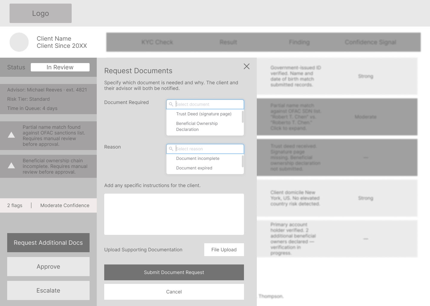
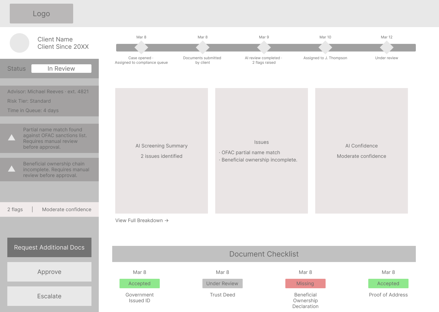
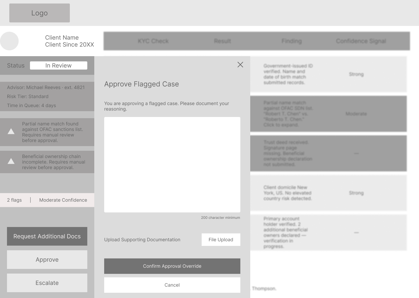
The AI explanation layer is the highest-stakes screen in this system. I designed how the results are displayed. The harder problem is what sits underneath it. Screen 15 assumes the underlying risk engine exposes per-check results through an API layer: result, finding, and confidence signal for each discrete check. Current enterprise compliance platforms typically surface aggregate scores, not check-level breakdowns. Validating that data contract with the vendor (NICE Actimize, Oracle FCCM, or Fenergo) is the first technical dependency before Screen 15 ships. I know what I don't know here, and that conversation with engineering is where the real design work starts.
I'd also want to test the check table on Screen 15 with actual compliance officers before committing to it. I designed it to be scannable. Whether that column structure maps to how a compliance officer actually reads and processes risk is something I need to watch in practice, not assume from the outside.
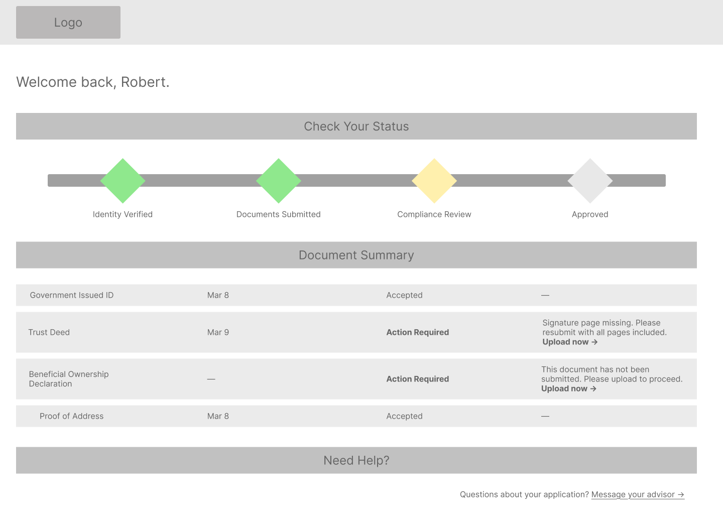
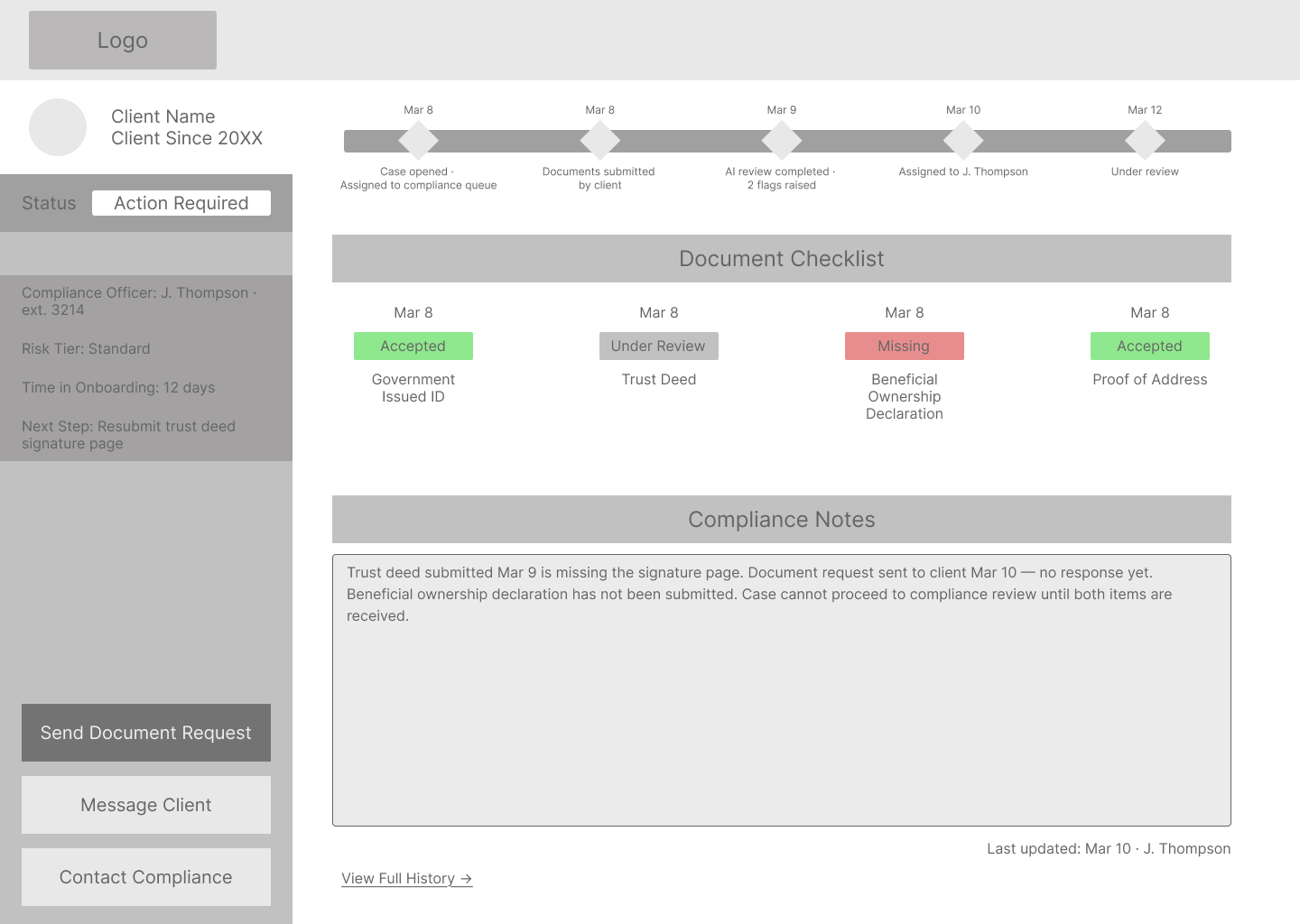
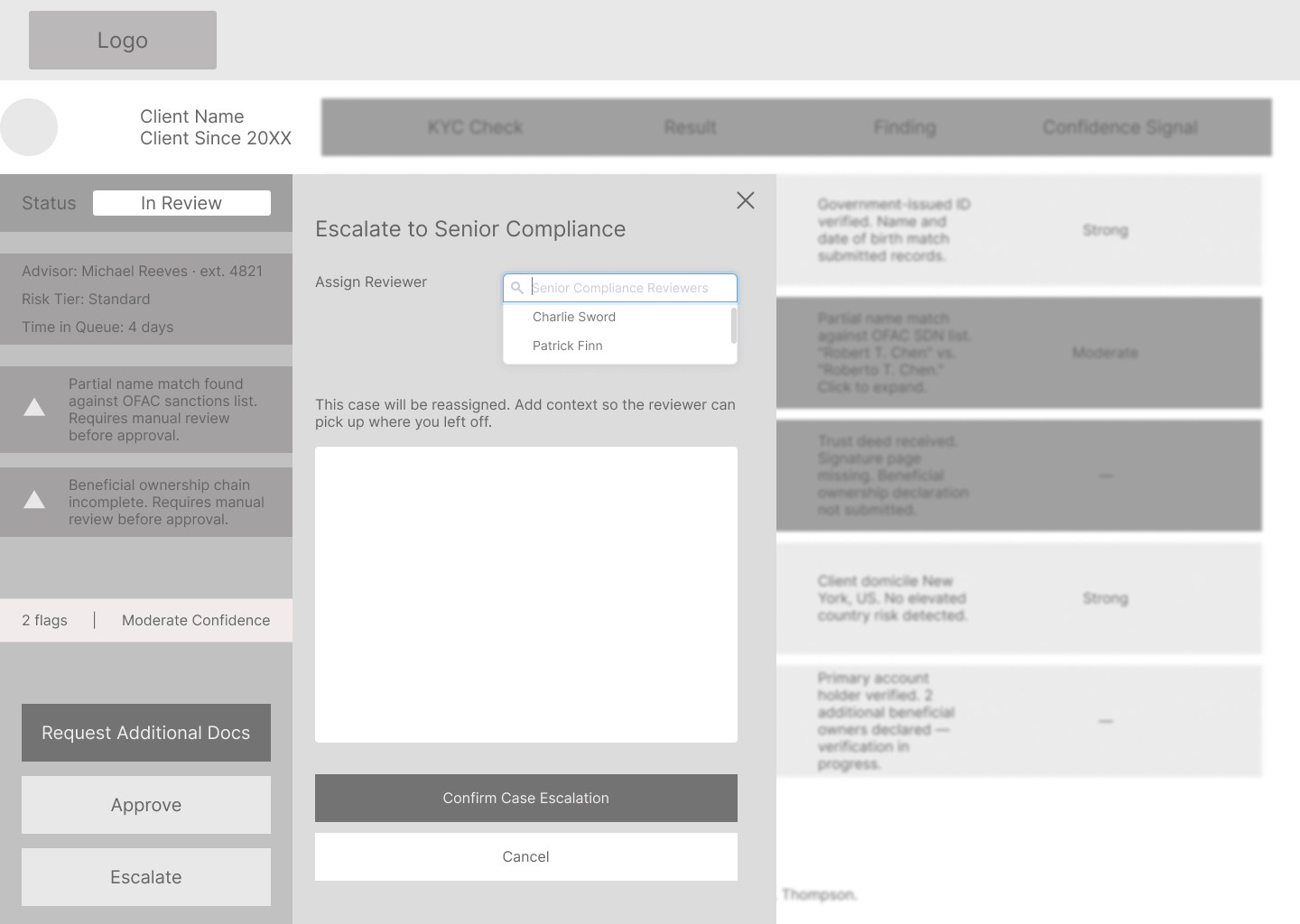
The design also doesn't address error states: what happens when a document upload fails, when the AI engine is unavailable, or when a case gets manually reassigned mid-review. And the write-back loop needs its own design pass. When Jessica approves or escalates a case on Screen 16, that decision has to propagate back to Robert's status view on Screen 5 and Michael's case detail on Screen 9. That coordination flow goes unaddressed in this version and is where the next design cycle starts.
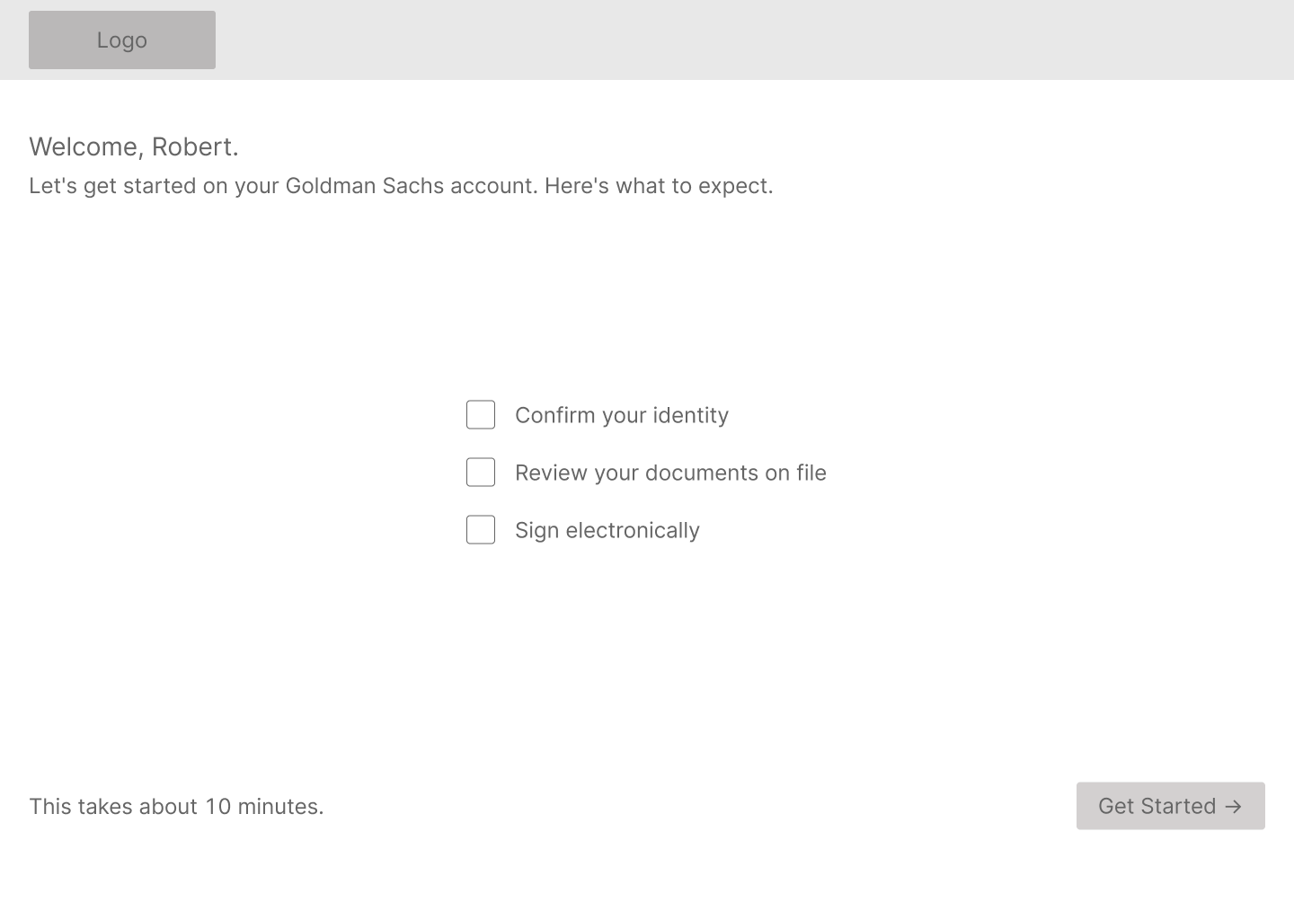
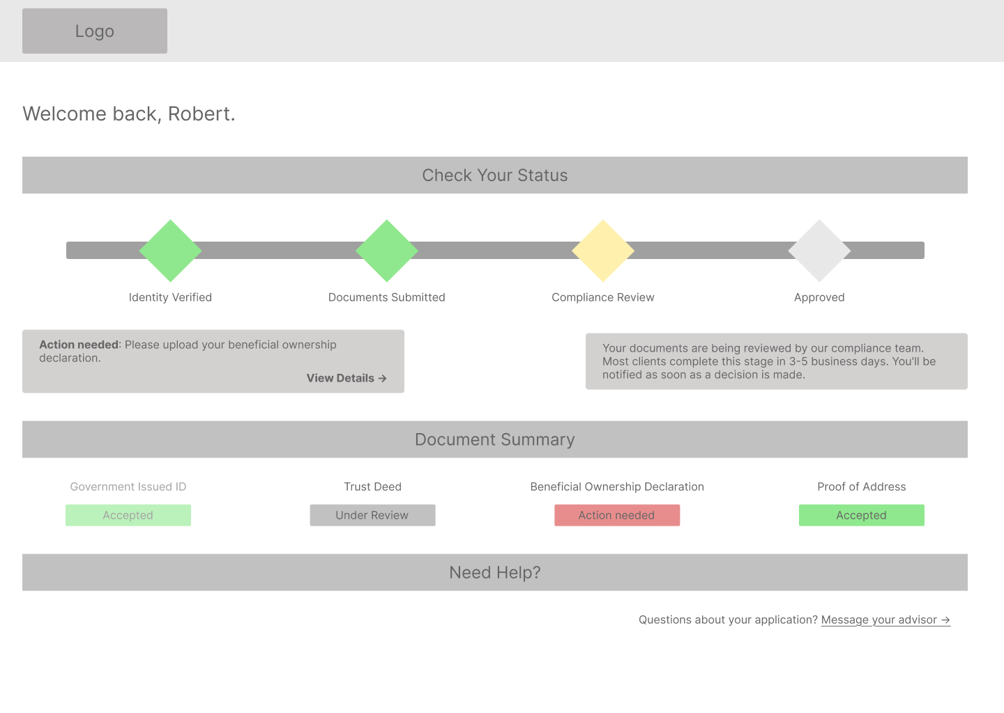
And the client flow language on Screen 1 needs real HNW client testing. "Enhanced Due Diligence" is deliberately plain, but how much upfront disclosure is the right amount, and how to frame it without making the process feel more intimidating than it needs to be, is something I wouldn't finalize without talking to actual clients.
Accessibility is also on the next-priority list. Client-facing flows are scoped to WCAG 2.1 AA, which is appropriate for the age profile of private wealth clients and a regulatory expectation in financial services. Extending that standard to the advisor and compliance interfaces, and building proper alt text into all image assets, is the next pass before this goes anywhere near a live audience.

Disclaimer: Speculative project, not affiliated with or commissioned by Goldman Sachs.

Kevin's Portfolio Assistant
Ask me about Kevin's work!

Kevin's AI Assistant

Ask me anything about Kevin's work!