United States Agency for International Development
Role:
UX Researcher and Designer
Team:
Harvard Tech for Social Good
Length:
6 Month Contract
Case Study Read Time:
5 minutes
Key Contributions:
Developing Tools to
Address Discrimination
in Schools
01. Overview
This project was my first time making product strategy decisions, alongside design. This role pushed me to think beyond just visuals and UX, but also about branding, market positioning, and business goals as a whole. I was trusted to take initiative on core features, competitor analysis, and early strategic direction, all while balancing user needs with startup constraints.
02. The Role
03. The Goal
The project aimed to develop a platform that highlights racial inequality in schools around the United States by compiling quantitative data from the U.S. Department of Education. However, as we fig deeper, we found that numbers weren't enough. The organizers we were working with preferred stories.
That insight led us to focus our efforts on solving the following core problem statement:
How can we design an accessible, user-friendly reporting tool that provides narrative context alongisde quantative data in a way that is useful for community organizers?
04. Adapting Our Approach
Challenge
Solution
The New Process

“We were essentially the Instagram police and called out fake influencers left, right and centre. It was fun and all, but there is only so many bikini chicks you can look at on Instagram before you start losing your mind.”
Dan, Co-founder and CEO of Lumio

“After this, we both took up golf during the week and started eating fancy dinners at the local Country Club... Ha. This is not what happened at all. We suck at golf and love eating Guzman Y Gomez.”
Adam, Co-founder of Lumio
05. Process
“We were essentially the Instagram police and called out fake influencers left, right and centre. It was fun and all, but there is only so many bikini chicks you can look at on Instagram before you start losing your mind.”
Dan, Co-founder and CEO of Lumio

“After this, we both took up golf during the week and started eating fancy dinners at the local Country Club... Ha. This is not what happened at all. We suck at golf and love eating Guzman Y Gomez.”
Adam, Co-founder of Lumio
Whilst in Germany, Dan worked with with brands such as Daniel Wellington and BMW - Ja!
Adam worked with clients like Vodafone, TAFE NSW, Adobe and also won the 'Good Design Australia' award for his work on the Seatfrog website.
To do this they would have to build a company that would be profitable in its first year. Not the next Uber of *insert clever idea*.
06.
The Final Product
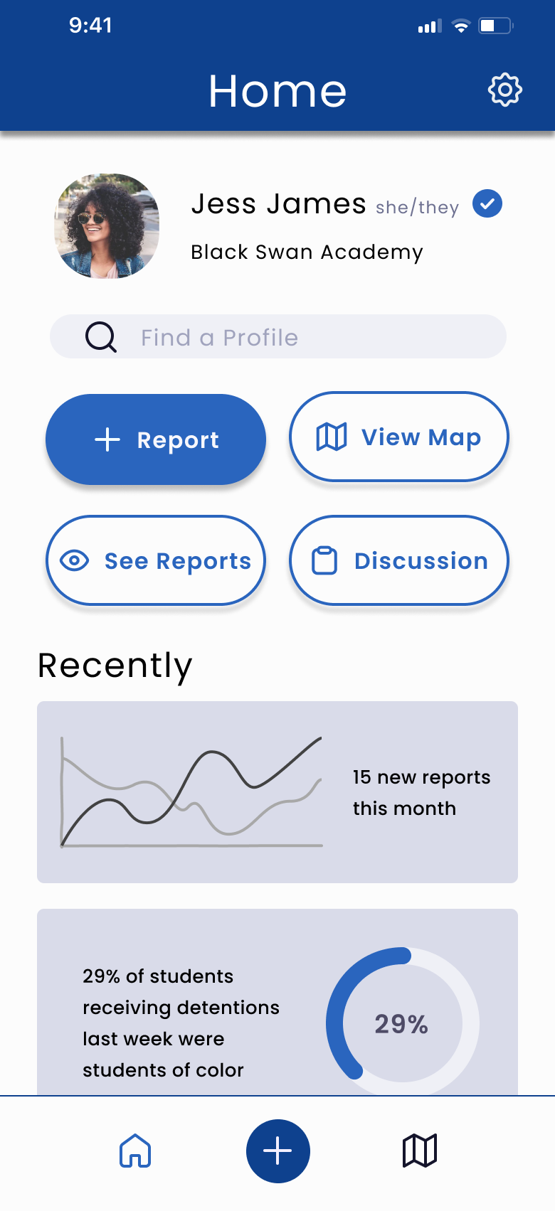
Home Screen
We wanted the home screen to do a lot, but feel like a little. It needed to welcome users, provide quick access to each major feature, and give advocates a sense of what's happening across schools.
The main actions (reporting an incident, viewing the map, seeing others' reports and joining discussions) are front and center. We've also added a clean prfile block and soft visualizations that preview recent trends. This allowed us to achieve our goal of making it easy to jump in while reinforcing a sense of community and purpose. At the bottom, the navigation bar allows the user to quickly make a report or view the map quickly from any screen.
This helped us meet our goal of creating a space where advocates act quickly, stay informed, and feel anchored in a larger movement for equity and transparency.
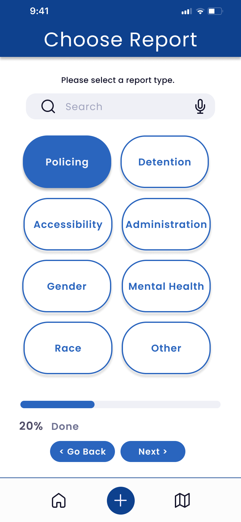
Reporting Flow
The Reporting Flow was built to feel approachable and empowering. From the start, users are given the option of their privacy level, so that they have control over how their report is used. Next, users can describe what happened in their own voice, while helpful tooltips and prompts provide just enough structure without feeling rigid.
We focused on making this flow easy to start, with optional fields that allow users to include as much or as little context as they are comfortable sharing.
This design supports our goal of capturing lived experiences in a way that's easy to share, organize, and act on, making community reporting a tool for both storytelling and change.
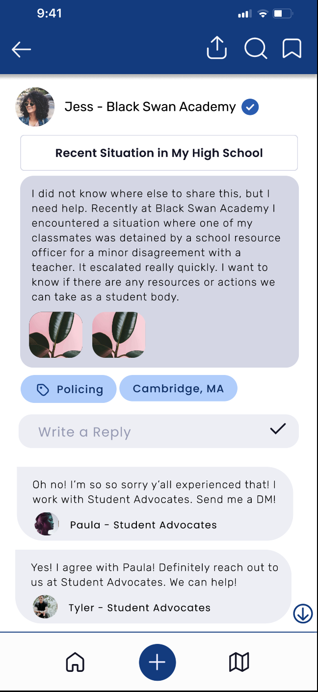
Discussion Board
We designed the discussion board to feel like a space for students and advocates to connect. Each sub-board is organized by key topics like policing, discipline, or mental health, giving users a focused polace to share stories, ask questions, and offer support.
The body of the post takes center stage with clean typography, making it easy for other to read and reflect. Below, replied are threaded, helping users follow conversations and offer support.
This flow not only supports community building, but also reinforces our broader goal of making qualitative experiences visible, valued, and actionable.
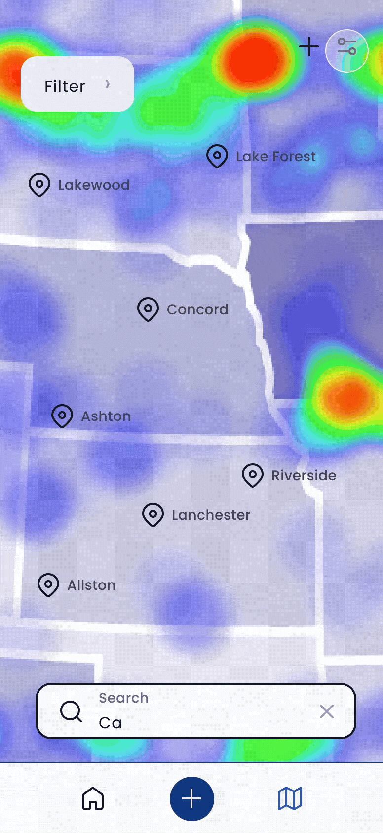
Map Flow
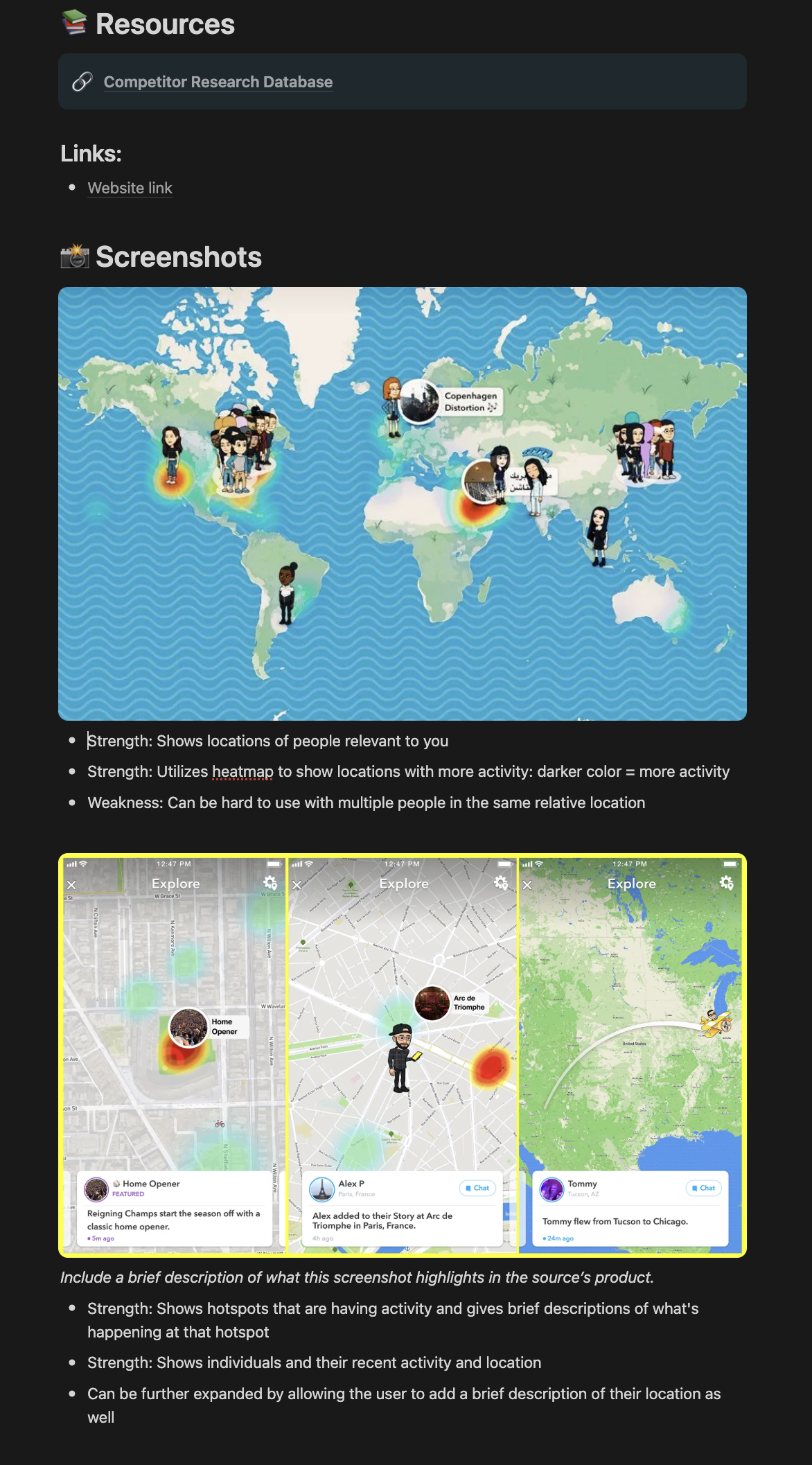
The map flow gives users a spatial understanding of where incidents are being reported across school districts. We designed it to feel clear and purposeful, surfacing recent reports through heatmapping. Users can filter by school type, school level, and funding, helping them quickly identify patterns and hotspots.
To support different need and contexts, we also built a map settings page where users can adjust display preferences, enable high-contrast modes, and simplify map views for better legibility.
By connecting stories to geography and offering control over how data appears, this flow tied directly into out goal of supporting organizers in targeting their advocacy while ensuring the experience remained accessible and actionable.
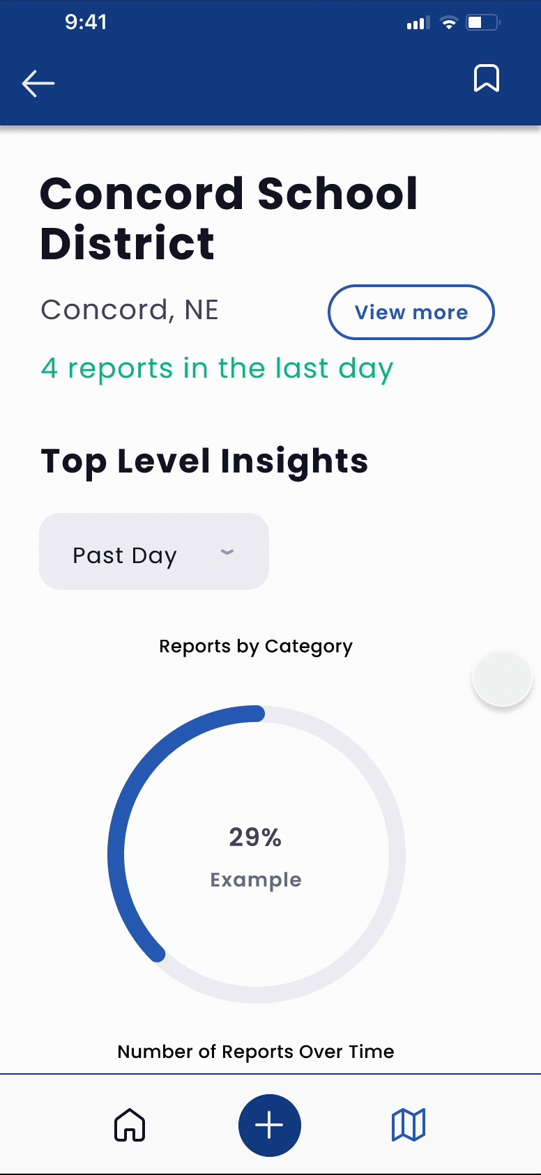
District Scorecard Flow
This flow gives advocates a quick, clear view of what's happening in a given district. They are able to view top level insights for the district during a chosen period of time, and then are able to filter and dive into individual reports to better understand patterns, stories, and urgency.
This directly supported our goal of helping advocates surface disparities, identify urgent needs, and tie quantitative data to qualitative narratives.
07. Looking Back
Winning
Moments:
Building trust with leadership. Having clear alignment with leadership early on gave me the confidence and trust to own major parts of the strategy and product direction.
Turning transcripts into direction. I didn't have fresh user research, but I was able to turn this missing step in my UX process into an opportunity to learn new methods of research.
Responding to tough feedback. When we learned that our designs weren't accessible enough, I didn't defend it. I redesigned it.
Lessons
Learned:
UX isn't always linear. I couldn't follow my usual playbook. I had to adapt, trust my insticts, and learn how to extract insights from whatever data I had.
Constraints can sharpen creativity. The limited timeframes, altered processes, and minimal feedback pushed me to be more resourceful and intentional.
Strategy is part of design. While thinking through user needs was a major step in the process, each decision had to be weighed with what would move the mission forward and make the platform sustainable.
Skills
Acquired:
Product Strategy. I was able to strategically think of how to align user needs with business goals through prioritized features, roadmap goals, and platform tradeoffs.
Figma Prototyping. I used advanced Figma prototyping skills to simulate full interaction flows and demo the product experience.
Designing for Accessibility. I designed accessible flows and components using WCAG principles to support an inclusive user experience for all users and abilities.