United Nations Capital Development Fund
Role:
UX Researcher and Designer
Team:
Harvard Tech for Social Good
Length:
4 Months
Key Contributions:
Designing smarter tools for digital financial inclusion
01. Overview
The platform helps government teams compare peer markets and design more inclusive digital financial policies. I contributed to user research, information architecture, and prototyping efforts to surface pain points, clarify navigation, and design a more actionable and approachable experience for global policy teams.
02. The Role
This was the first UX project I worked on, and it gave me a foundation in user-centered design across different cultures, regions, and roles.
I contributed to user interviews with international stakeholers, helped synthesize research findings, and worked on prototyping a redesigned structure for a benchmarking guide used by policymakers around the world.
Our team focus was on making the guide easier to navigate, less overwhelming to interpret, and more aligned with how real users approach peer comparison.
In this role, I:
- Interviewed stakeholders working in financial inclusion across multiple countries and regions
- Synthesized insights through affinity mapping and helped define key design opportunities
- Prototyped improved layouts and wireframes using Figma
03. The Goal
Problem
Goals
Key Questions
- The UNCDF guide included valuable datasets but presented them all at once, with varied data quality, inconsistent terminology, and missing context.
- Users struggled to compare countries or interpret visualizations confidently
- Some stakeholders didn’t trust the data due to lack of sourcing or clarity
- Make data easier to explore, filter, and understand across different countries
- Improve consistency and transparency around sources, definitions, and metrics
- Help users choose the right resource for their needs and understand how to use it
- Reduce information overload through progressive disclosure and modular design
- How can we help users compare peer markets without overwhelming them?
- What’s the best way to present data when users have different levels of context or expertise?
- Where do users need explanations, translations, or walkthroughs?
- How do we support meaningful data interpretation across international settings?
Why it Matters
Over 416 million adults in Sub-Saharan Africa are unbanked or underbanked, limiting access to formal financial systems
Governments want to design more inclusive financial policies, but lack tools to learn from peer countries
Confusing or inconsistent data can lead to misinformed decisions or stalled reform efforts
A clearer, more structured UX helps users trust the information, focus on what’s relevant, and act on it across a range of international contexts
05. Research and Design
Audit, Scope, Align
From there, I used these insights to scope the research plan, organizing interviews into two tracks: user research with field staff who use the tool daily and stakeholder research with program managers and leadership who relied on the platform for tracking and reporting. This distinction allowed us to capture the full range of needs and expectations across the system.
- Audited platform structure and mapped core workflows across modules
- Identified early usability risks and areas of structural complexity
- Defined product scope to guide research and design
- Structured two research tracks: daily users vs. strategic stakeholders
- Set project cadence, stuctures, and deliverables with team
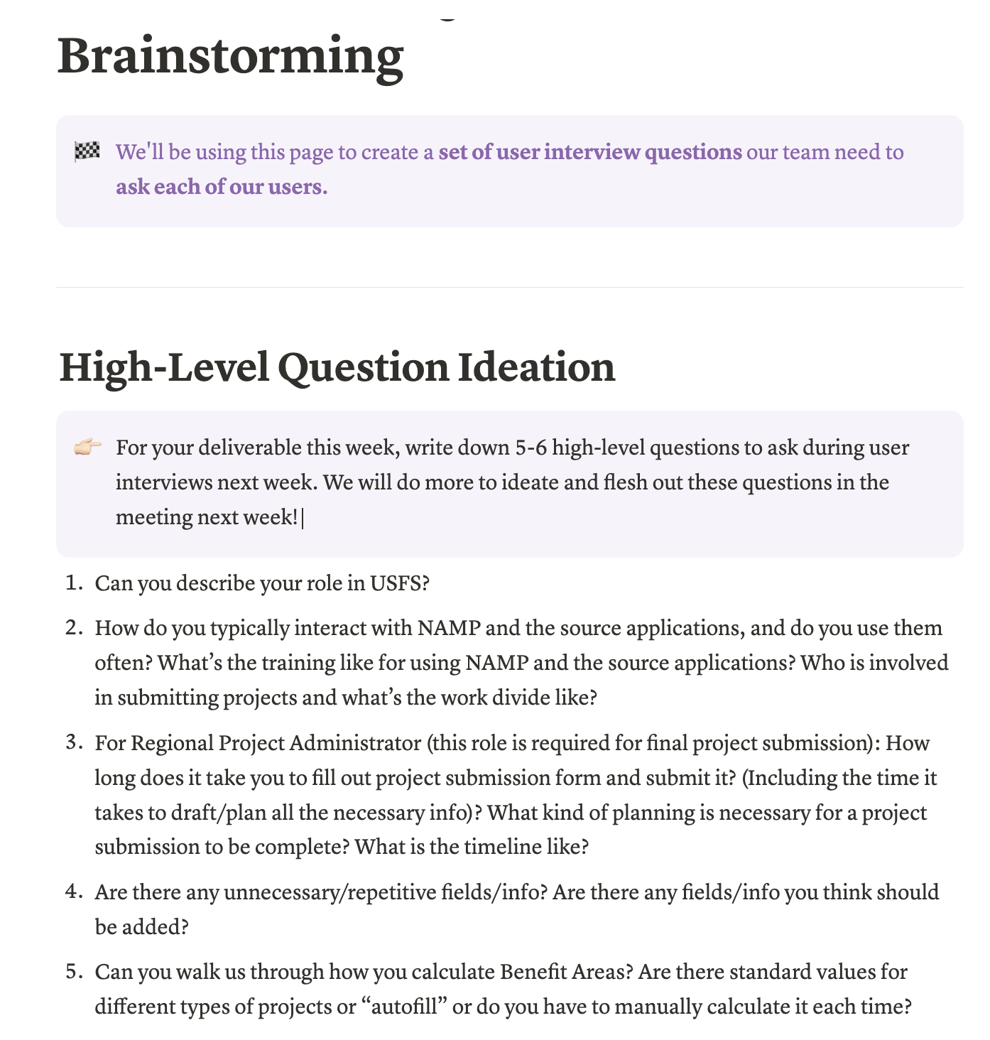
Interview & Synthesize
These insights then grounded the creation of user personas.
- Ran affinity mapping workshops to organize qualitative insights
- Created user personas representing core roles and usage patterns
- Mapped out ideal user flows across submission, tracking, and reporting
- Facilitated alignment around which flows to prioritize for redesign
Flow Mapping & Midpoint Alignment
We then shared these flows, along with all of our research and design direction thus far, during our mid-point check in with stakeholders. Their feedback helped validate our approach and align the team around priorities for the second half of the project.
- Translated interview insights into current-state and ideal-state user flows
- Converted insights into decision points and failure paths for field and admin users
- Scoped design priorities based on workflow impact and stakeholder needs
- Developed and led midpoint presentation to USDA team to align on direction
- Used stakeholder input to refine roadmap and prioritize next phases of design work
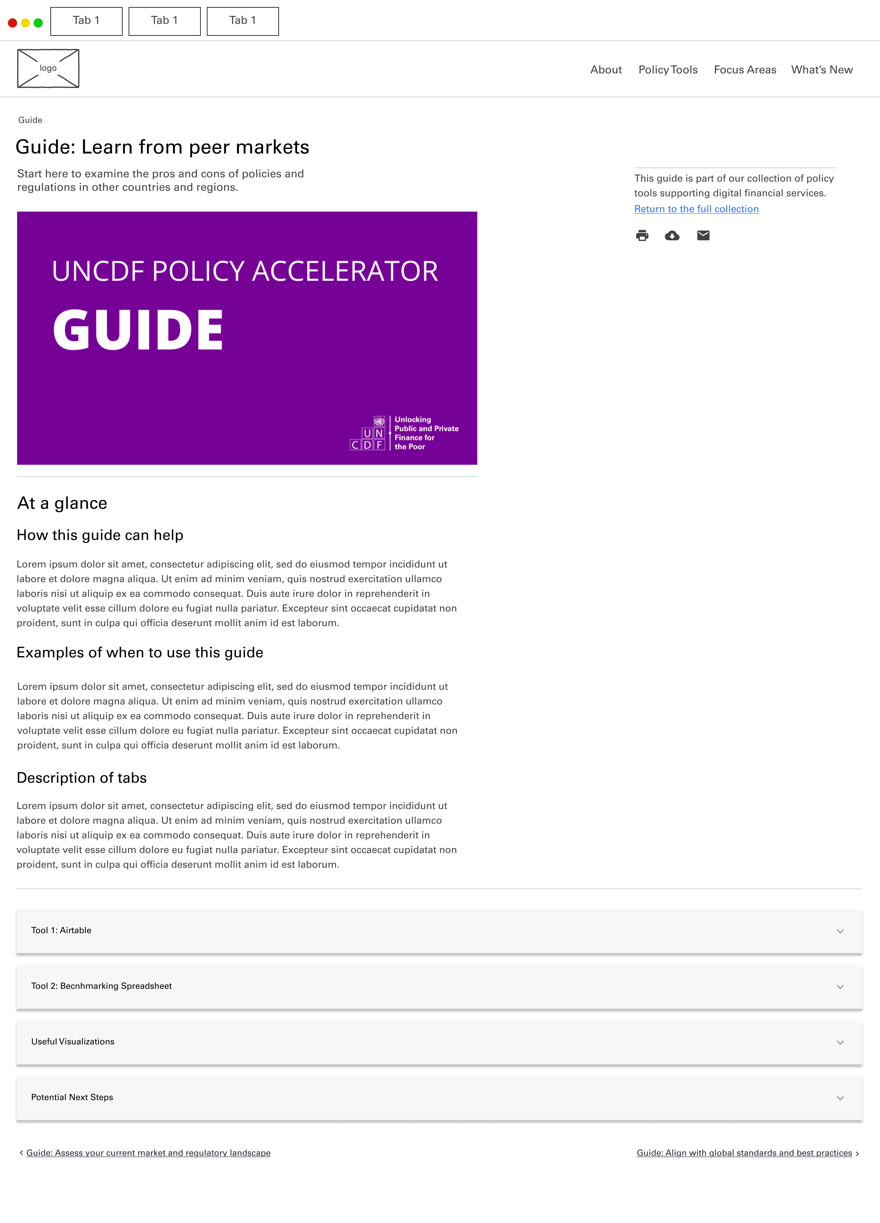
Lo-Fi Design - Infra Projects Module
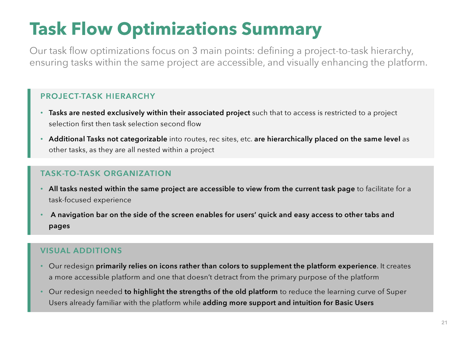
We created lo-fidelity wireframes for prioritized workflows, rethinking layout and navigation patterns to reduce friction. I also established team design principles around modularity, clarity, and accessibility.
- Re-architectured key flows within the Infra Projects Module
- Consolidated scattered information into a unified overview screen
- Introduced clearer hierarchy, information architecture, and labeling for project timelines and tasks

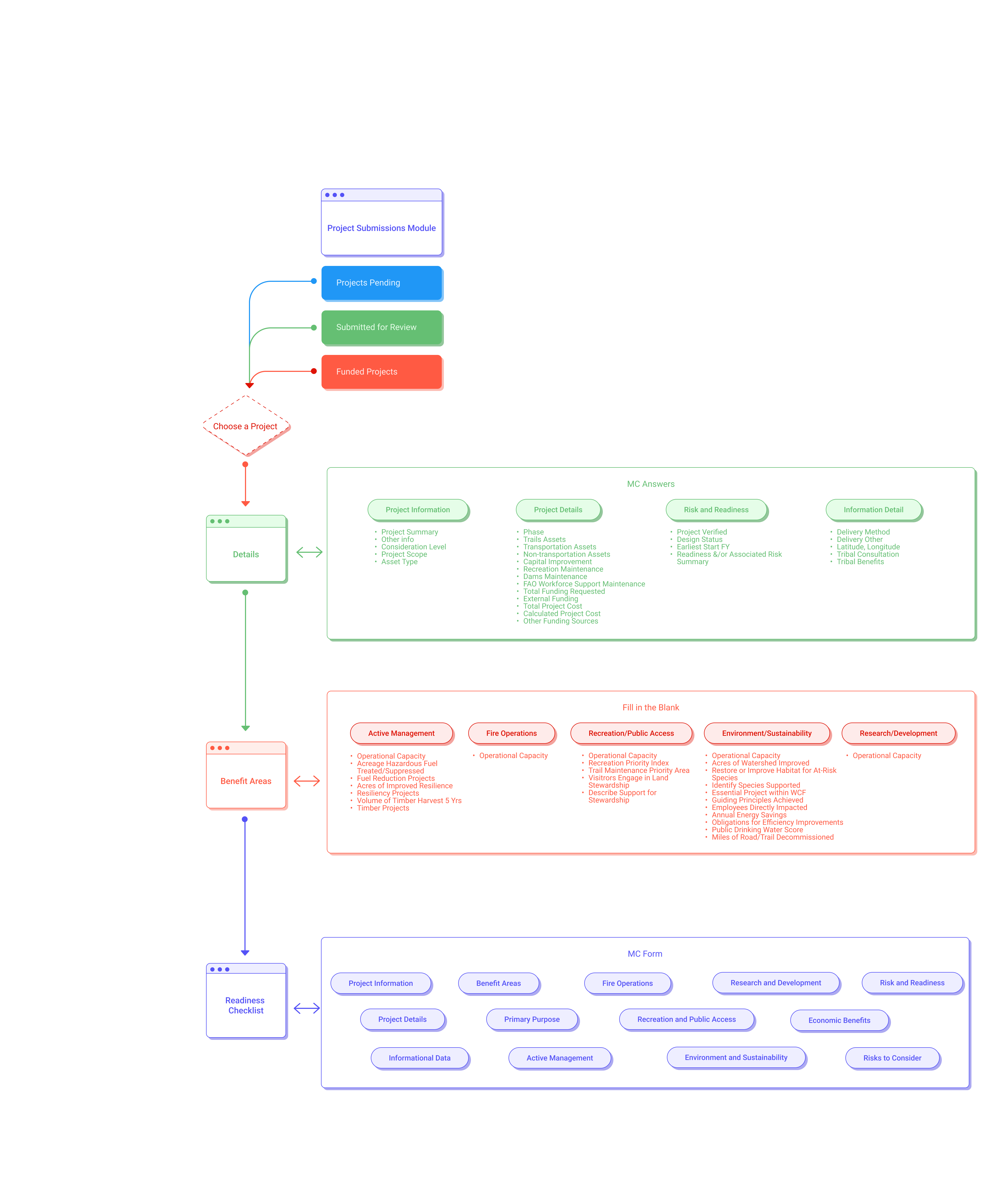
Lo-Fi Design - Submission Module
We redesigned the submission experience to better guide users through key steps, clarify required fields, and improve the overall architecture of the form. I also scoped design components that could be used across other modules to support long-term consistency.
- Redesigned the multi-step submission flow for clarity and usability
- Structured forms to surface key details earlier and reduce user error
- Scoped key interaction patterns to carry into future testing and iteration

Usability Testing & Hi-Fi Designs
I focused on applying a consistent visual system across both the Infra Project Module and Project Submission Module, including layout, spacing, and typographic hierarchy.
- Conducted moderated usability tests with five users across roles
- Iterated interactive, high-fidelity prototypes based on test insights
- Refined spacing, architecture, and color to improve clarity and usability
- Designed with accessibility and long-term scalability in mind

Documentation, Handoff, & Presentation
I also led our final stakeholder presentation, walking through user research, design strategy, user flows, and product strategy. This worked to create alignment and momentum for future implementation.
- Created annotated Figma files with component usage
- Documented research insight and design rationale for each module
- Delivered final walkthrough for stakeholders, including design recommendations
- Packaged visuals and prototypes for handoff to internal tech teams
05. Process

“We were essentially the Instagram police and called out fake influencers left, right and centre. It was fun and all, but there is only so many bikini chicks you can look at on Instagram before you start losing your mind.”
Dan, Co-founder and CEO of Lumio


“After this, we both took up golf during the week and started eating fancy dinners at the local Country Club... Ha. This is not what happened at all. We suck at golf and love eating Guzman Y Gomez.”
Adam, Co-founder of Lumio
Whilst in Germany, Dan worked with with brands such as Daniel Wellington and BMW - Ja!
Adam worked with clients like Vodafone, TAFE NSW, Adobe and also won the 'Good Design Australia' award for his work on the Seatfrog website.
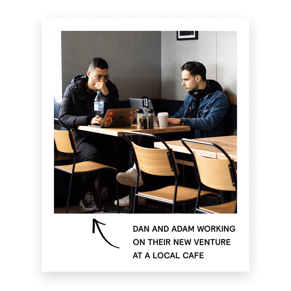
To do this they would have to build a company that would be profitable in its first year. Not the next Uber of *insert clever idea*.
06.
The Final Product
Infra Projects Module
We redesigned this screen to streamline project review and help users more easily understand what’s happening across the system. The original layout buried key details in tabs and nested tables, forcing users to click through multiple views just to get basic information.
In the new version, we grouped projects by region, surfaced project status and funding stage directly on the card, and simplified the visual hierarchy to reduce cognitive load. During usability testing, users described the new layout as “more intuitive” and “way easier to scan," especially those who only log in occasionally or manage dozens of projects at once.
This helped us meet our goal of reducing friction in daily workflow, improving accessibility for both frequent and infrequent users, and supporting faster decision-making without requiring external tools.
Project Submission Module
Submitting a new project used to be one of the most frustrating tasks on the platform. The original workflow was rigid, visually dense, and required users to memorize a sequence of steps across multiple pages.
We redesigned the experience around clarity and progression. We introduced a guided, step-by-step submission flow with built-in field validation, contextual help, and a persistent summary panel. These changes were especially helpful for users who only submit projects a few times a year and often needed support.
During usability testing, participants noted that the new flow made them feel “more confident they were doing it right” and “less likely to make mistakes.”
This design supports our goal of supporting the submission process and reducing the need for outside guidance, allowing projects to be submitted more quickly and accurately.
Full Flow
This animation reflects the full journey from a user's perspective, showcasing how we streamlined a previously fragmented process into a guided experience that's structured, informative, and easy-to-follow.
06. Looking Back
Outcomes
Achieved:
- Redesigned 2 high-traffic modules used to manage over $1 billion in annual funding over 150 national forests.
- Directly incorporated field agent's comments into designs process ("I just want to see everything on one screen") allowing it to serve as guiding principle in our redesign.
Winning
Moments:
- Aligned cross-functional stakeholders with competing priorities by translating feedback into shared design goals.
- Directly incorporated field agent's comments into designs process ("I just want to see everything on one screen") allowing it to serve as guiding principle in our redesign.
Lessons
Learned:
- Speak everyone's language. Translating between technical, policy, user needs, and design mindset was necessary to keep team moving forward.
- Don't design too early. While designing was fun, user research was essential to making sure we were designing the right things.
- Scope alignment is a living process. The scope shifted continuously throughout the process based on research, stakeholder input, and roadblocks along the way.
Skills
Acquired:
- Flow Modeling. Learned to translate ambiguous workflows into structured, multi-step flows grounded in user logic.
- Modular Design Systems. Built reusable designs that support flexibility amount various modules and future development.
- Cross-Functional Alignment. Practiced aligning engineering, design, and policy through documentation, meetings, and iterative feedback cycles.